The following is a sample of student work done this school year in Photography I. Students were to choose their favorite artwork, some straight through the camera and others adjusted in Adobe Photoshop. I'm quite proud of the accomplishments of these students, I hope you enjoy perusing!
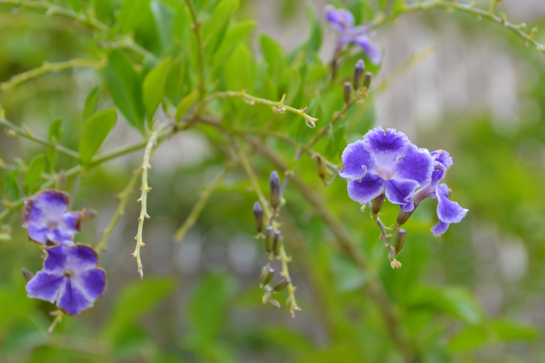
Daisy Aguilar, Class of 2014, "Shimmer" The title of my artwork is "Shimmer". The reason why I titled my artwork that name is because the purple flower stands out from the green and the two flowers on the right are the ones that are more focus on and detailed. I took this photo behind the weight room. What I was aiming for in this photograph was to make the color of the flowers pop. To create my image, I used Program mode, with an ISO of 400 and the fstop at f/8 & shutter speed at 1/60th of a second.
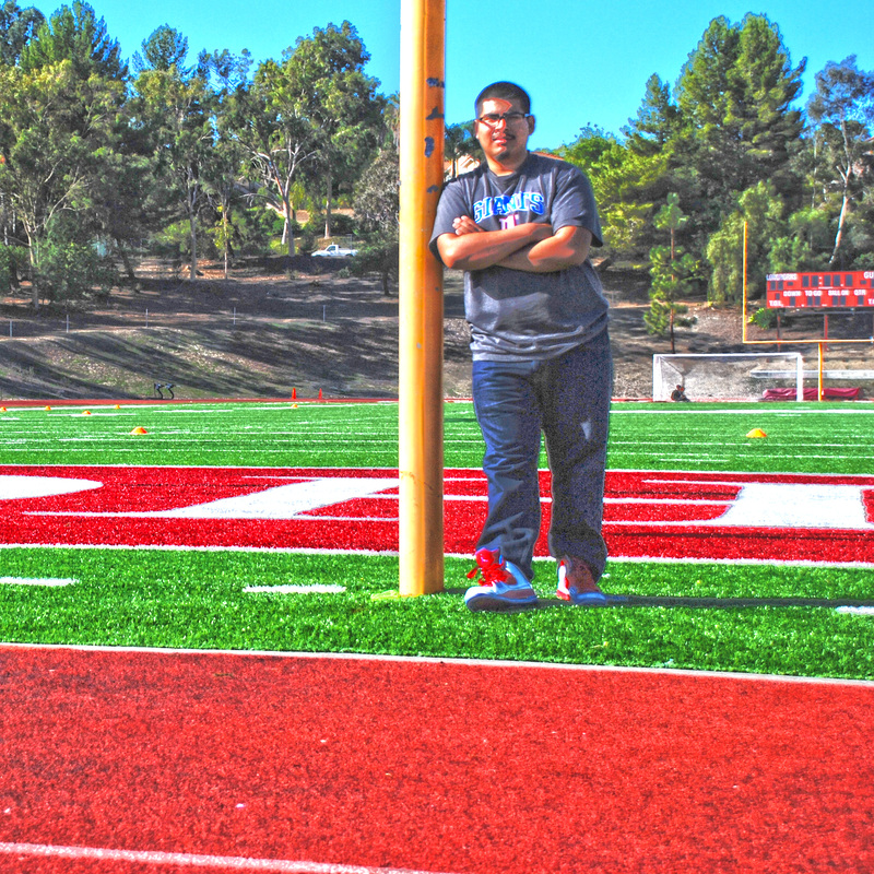
Michael Aguilar, Class of 2014, "My Picture." I like the picture of Austin and I believe it’s the best picture I've taken all year. It came out raw and I haven’t seen someone else take one like it. I had a lot to do in in Photoshop to make it hdr requirements like selecting all the photos and combining it and also adding more saturation. My photo composition is the rule of thirds and I believe it really is a work of art.
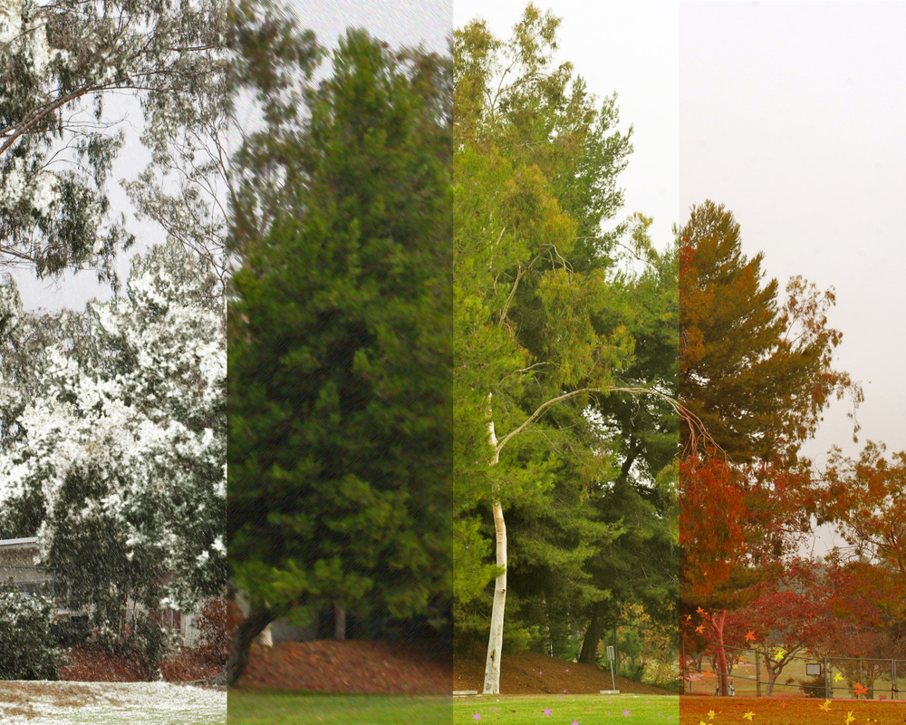
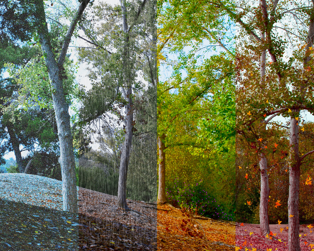
Maria Albarran, Class of 2014, "Nature." The title of the photograph is called "Nature." I named it nature because it does have to do with nature and since the seasons change because it's part of their nature to change. I took this picture while I was walking around on campus to find something that can really show how the seasons change. The main objects in the picture are the trees since they are the ones that stick out the most and since trees are the ones that change their color every time that the seasons change. In the photograph you can tell that the seasons are changing and that's what I was aiming for because it's really nice to see how the seasons change since no one really stops and actually stares at things anymore. I really like this artwork because it's really beautiful and it shows nature and how it changes by it self without anyone telling it when or how to do it. To make this photograph I had to crop each section of the different seasons to a certain size and I had to work on each photo one by one. I also had to change the saturation on certain sections to get the color that they all have and I also had to add effects so that all four sections of the picture looked like the four seasons.
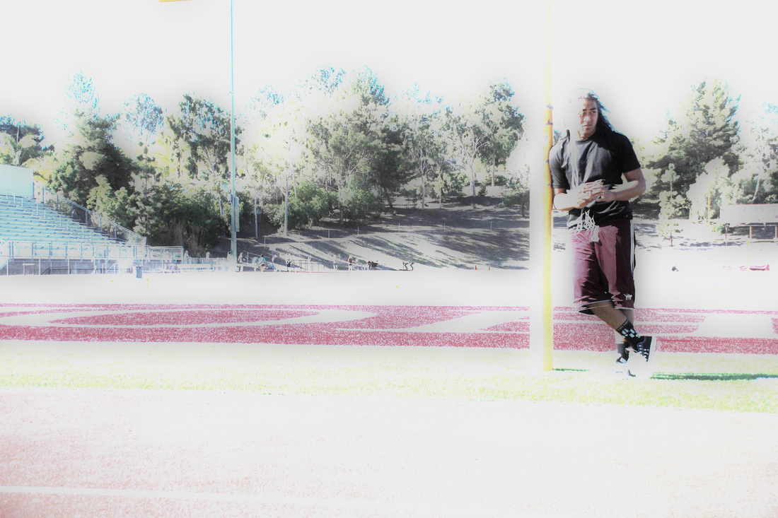
Austin Alualu, Class of 2014, "Jody." This is a HDR photo. I titled this 'JODY' because its a picture of my friend Jody.I took this photo at the football field. I just made him stand on the goal post and he was the main subject.I chose this because it has nice effects to it. It just makes it stand out really nice. I used HDR Pro and edited it.
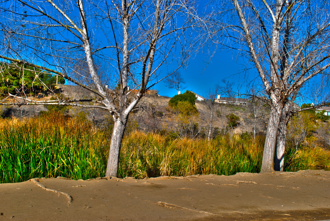
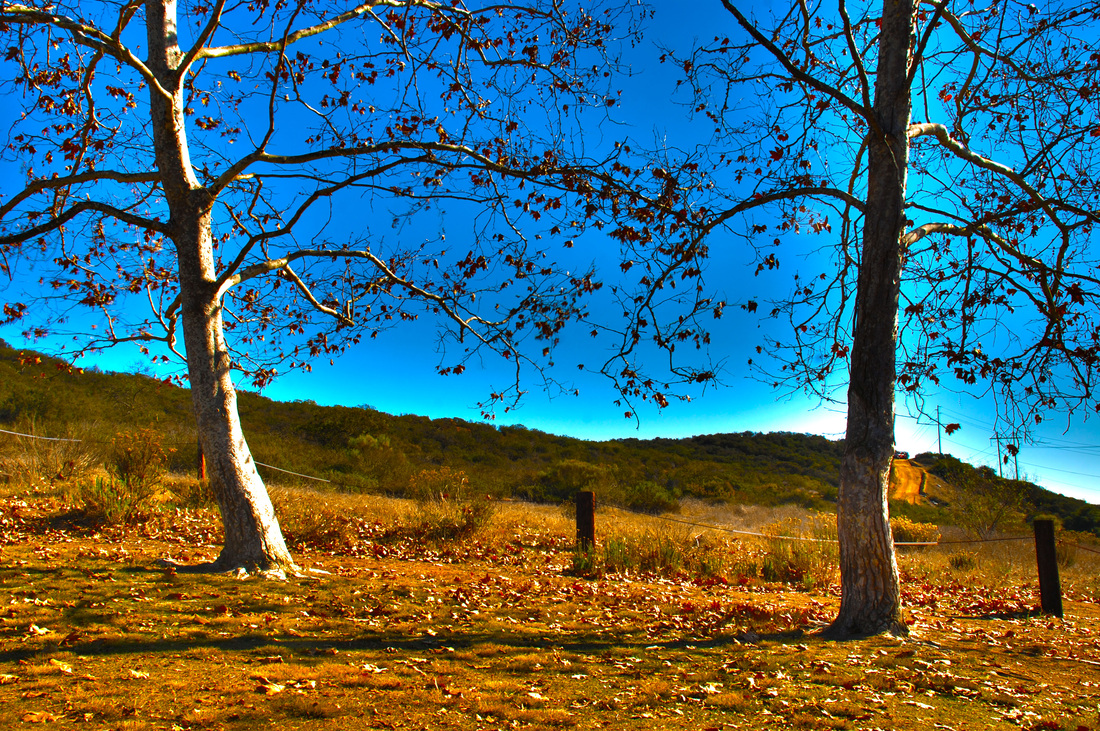
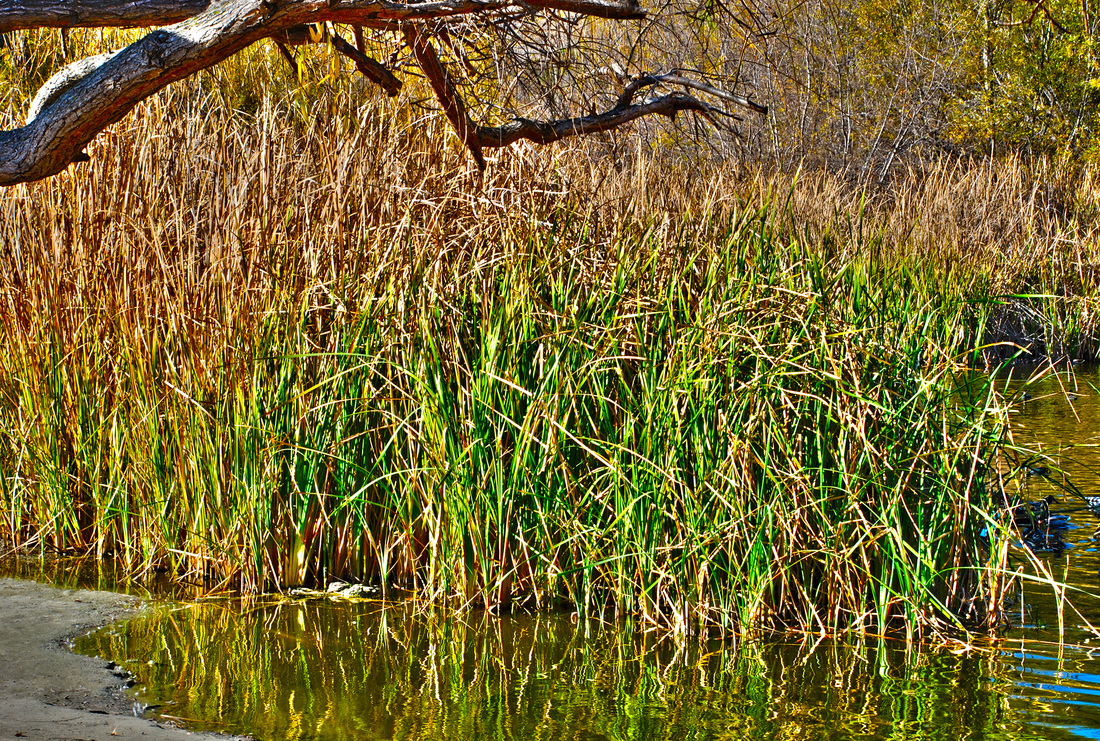
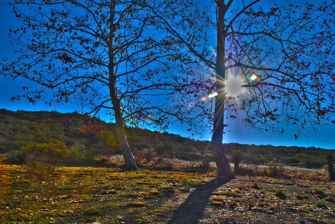
Vanessa Alvarez, Class of 2014, "Bare Trees." I named my photograph Bare Trees because there are multiple trees with no leaves and it's what I like most about the photo. I took the photo at the duck pond. The main subject of the photograph are the trees and the long grass that grows on the pond, and some houses in the background. I was trying to show the trees and how they no longer have leaves on them. I like this photograph because I like the way the trees look against the blue sky with the houses in the background. I took five photographs of the same setting and merged them together on Adobe Photoshop and saturated it to make the details pop out more.
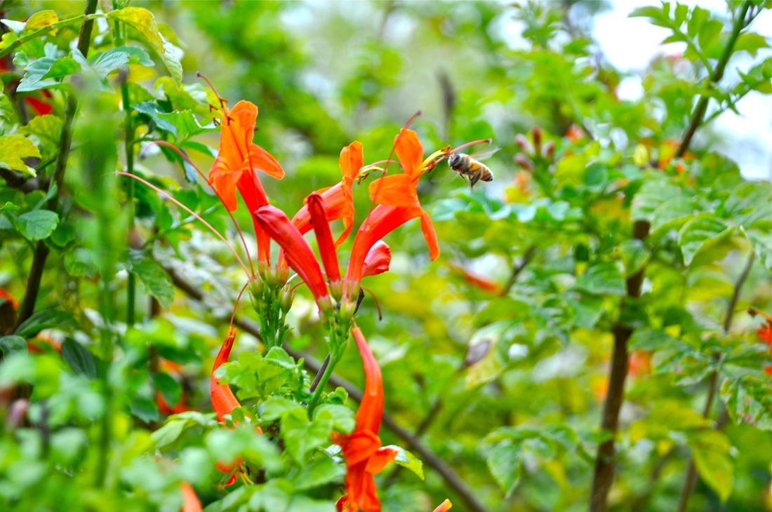
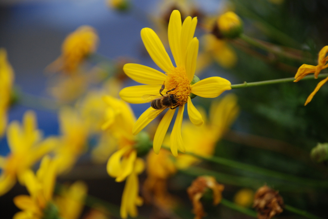
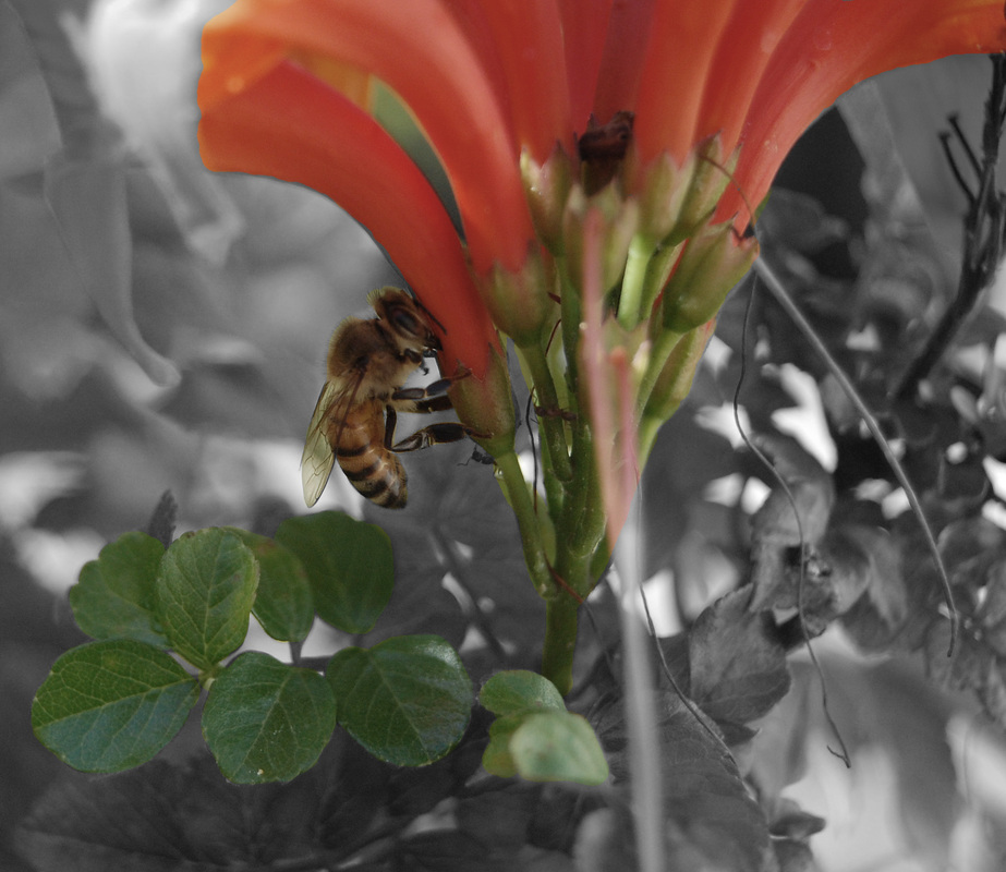
Megan Anders, Class of 2014, "Fearless" The title of this picture is Fearless because when I see the picture I think of it being young, struggling to survive, finding food in the flowers. I took the picture in the little garden we have by the weight room and I took it at a close up vantage point. The main subject is the bee and it looks like its trying to find food somewhere. We were working on our vantage points so I was aiming for the "close up" look. I like this picture because of how bright the oranges and greens are and how well they compliment each other, and also because the bee is in motion and it makes it look more cool. The steps I used in photoshop was I bumped up the contrast and brightness, adjusted saturations and hues of certain colors, and I also cropped a little because a lot of the picture was just the green plant, so I focused it more on the bee and flower.
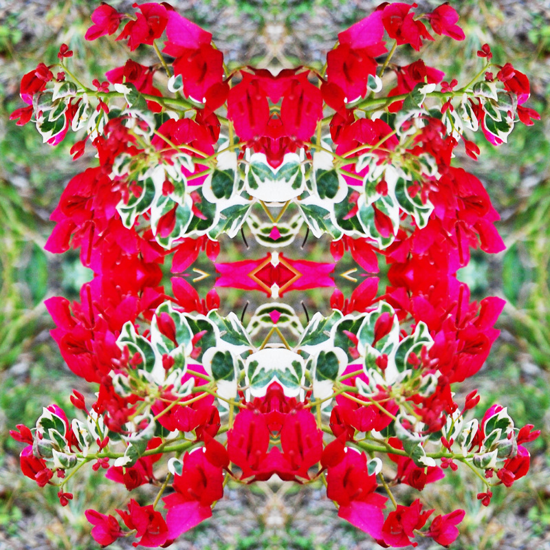
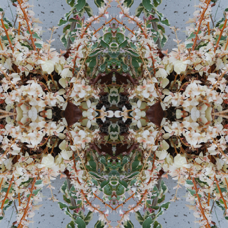
Asra Andrews, Class of 2015, "Neon Flowers" The title of this project is "Neon Flowers". It is called neon flowers because how vibrant and full of color this picture is. I took "Neon Flowers" at Rancho Buena Vista High School by our 200's bathroom of a mural art students put together. The main subject of "Neon Flowers" is the center of the photo. The center of the photo is a few leaves and two flowers that come together to look like a spider. I like this photograph because it was the best one of the five I created and it was full of color. I also like this photo because it came together nicely in the center to create something better than just flowers and leaves. In adobe photoshop I created a template and duplicated every layer so I had four of the same image. After that I flipped the photos until they came together in the center and created a picture I liked. I also adjusted the hue and saturation and enriched the colors.
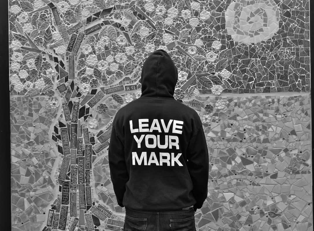
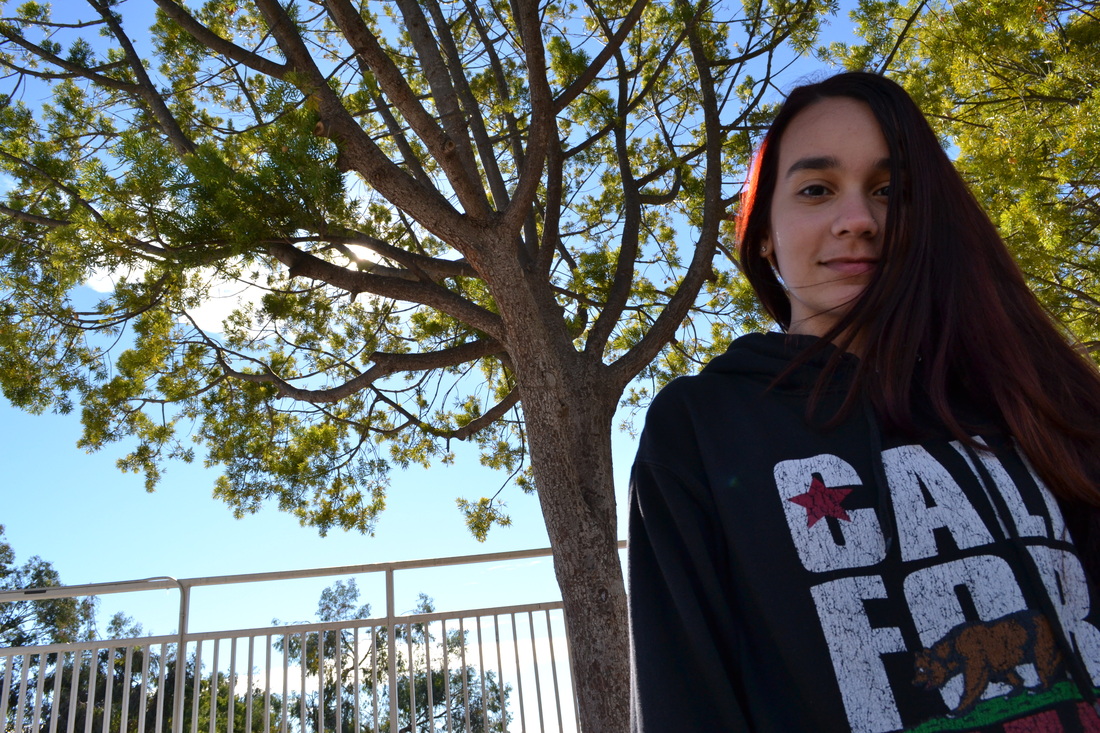
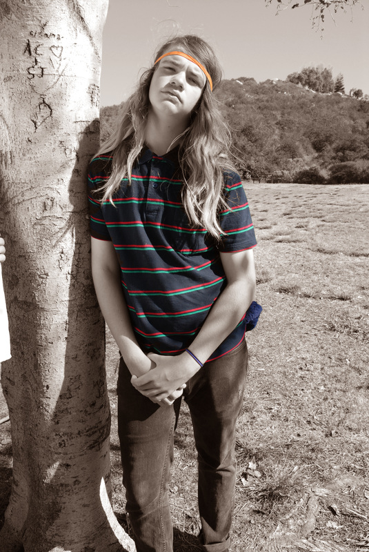
Angelica Arnal, Class of 2014, "Leave Your Mark." I took this photo by the 200's bathroom of my friend Francisco. The main subject of my photo is the theme of his sweater logo " Leave your mark ". My friend is facing looking at the tree knowing he can follow his dreams.I was aiming towards that anybody is possible to follow their dreams and their goals and leave their mark.I really like this photo because the lettering in his sweater stands out and proves my point in this photo. I edited it by changing the photo to black and white and also kinda blurred it to make the letters stand out.
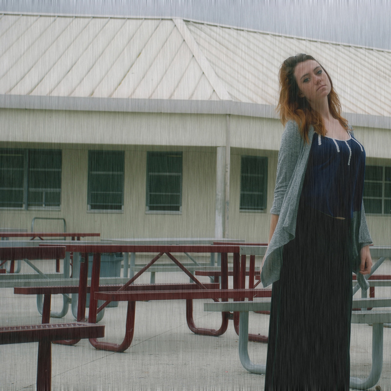
Falepolima Aviu, Class of 2014, "Make It Rain" Make it Rain is the title of this artwork, it is titled that way because the way I like it and it looks like its raining in the photo. I took this photo in the main quad. The main subject of this photo is Katie as the model and her face is very serious make the photo so good. This is what I was aiming for because we were just taking modeling photos and in here she looks really good. I like the photo because its not only rule of thirds but i edited it to make it look like its rainy, when really it was a sunny day. I added noise to the photo and blurred it so it could look like it was raining.
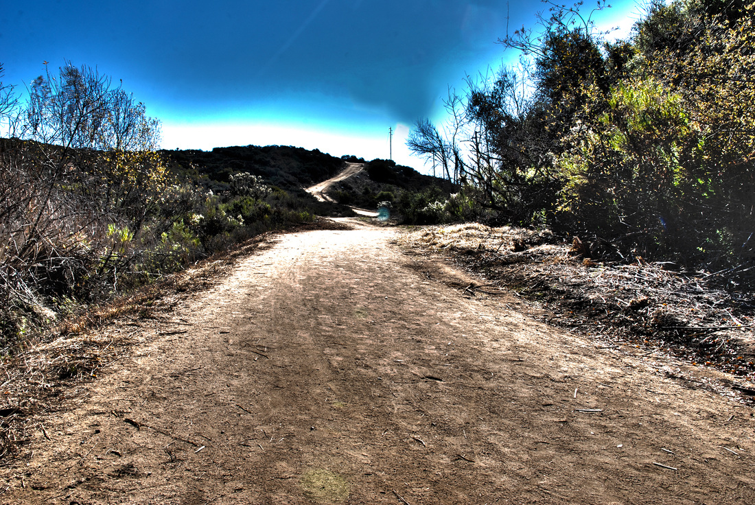
Kathleen Baldelomar , Class of 2014, "The Bridge To Narnia." I took this photograph at Rancho's softball field. I titled this the bridge to Narnia because its the bridge that leads to Narnia thats it. I like this photo because it looks really cool and the landscape is so beautiful. The main subject is the bridge. Nature is going on in my photo. What I was aiming for was the beauty and the line of the bridge to get the audience's attention. Why I like this photo is the way the bridge get the audience attention . Sort of like the leading line. I didn't do any photoshop work, all I did was add some contrast to it and turn it black and white.
Cecilia Barrios, Class of 2014, "Nature's Beauty". I titled my photograph "Nature's Beauty" because the picture portrays both nature and the beautiful Karla who was the model for this photograph. The photograph was taken at the Duck Pond by the tall shrubs and a tree. The subject of the photograph is Karla I wanted to bring out her natural beauty by having colors such as brown, tan, and green bring each other out. Karla's brown eyes and hair really compliment the tree and the dark shrubs in the background. I wanted it to look as professional as possible so having her face look more warm really gives it a summer vibe. I like this photograph because in my opinion it looks like a professional photograph it was also nice that the model herself really loved the picture. Having her in close focus really brings out all of her facial features and the contours and highlights. The only technique I used in Adobe Photoshop was to make the photograph more warmer in color to give her skin a natural glow and tan. I also fixed up any mistakes in her face by using the healing tool which removed the dust particles.
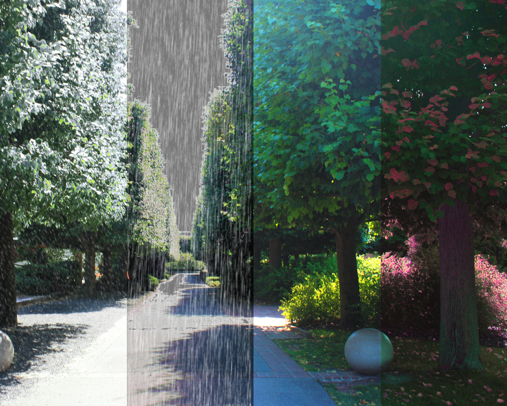
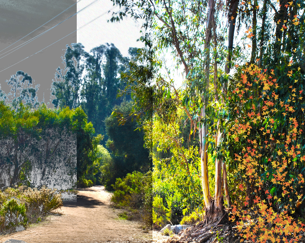
Camille Bassett, Class of 2015, "Four Seasons." The title remains four seasons because this picture is simply four seasons. I took this photograph in Chicago, but I edited it in class in photoshop. This photograph was in a botanical garden and it was a pathway lined with shrubs. My intention was to show the different seasons in the same area, and what each season would look like in that specific area. I like this artwork because it is very drastic and a strange photograph. I am submitting it because many people suggested me to, and it's also pretty interesting. In photoshop, I divided the picture into four sections and I changed the contrast and saturation of each section. Then I also colored leaves and added in rain and snow as well.
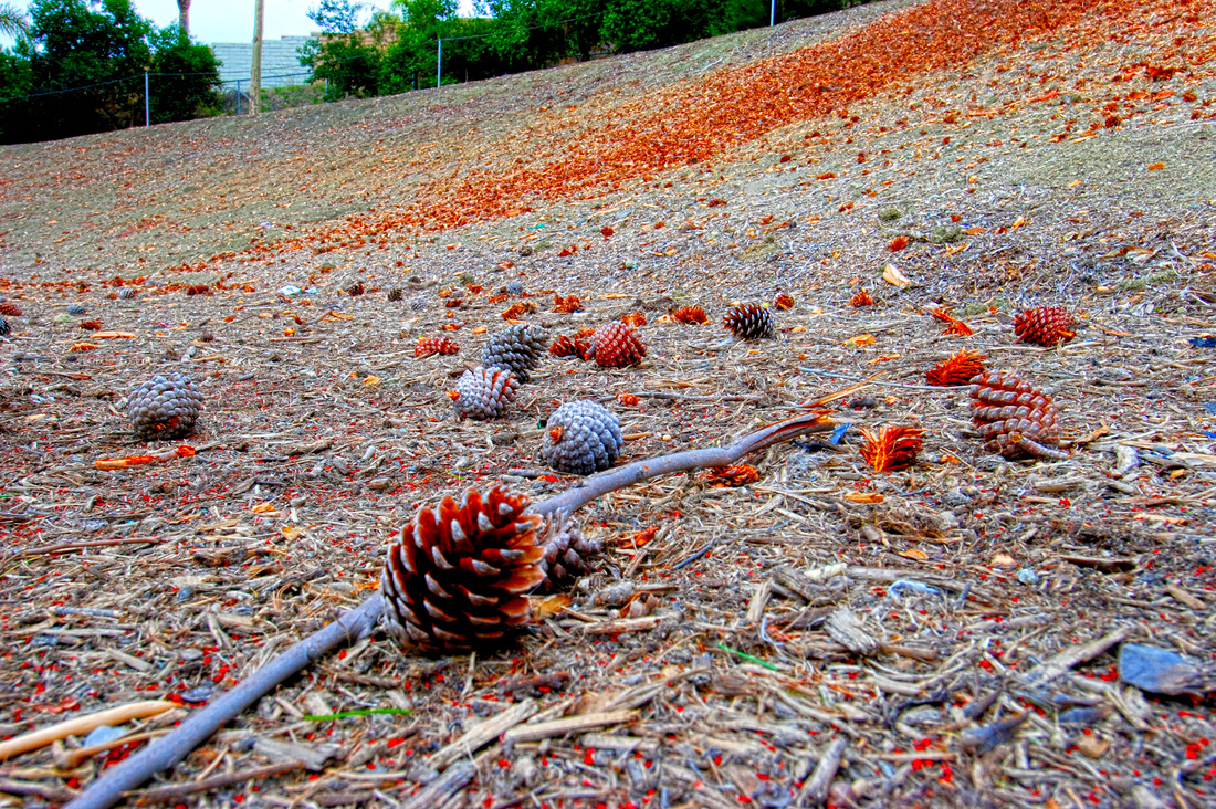
Yanely Bautista, Class of 2014, "Color filled Fall" The title of my photograph is "Color filled Fall". I named it this because when you think of the fall time, you imagine reds and oranges, and that's what the photograph is filled with. The first thing you notice in the picture is the various shades of orange and red. I took this photograph behind the football field. The main subject is the pinecone in the foreground, but I also wanted the viewer to focus on the colors and the small details in the texture of the pinecone. I chose this photograph because I like taking close ups of things. I like being able to capture small details that normally people wouldn't notice. Nature itself is beautiful, but the focus tends to always be on mountains, trees or bodies of water. Most don't stop and look and appreciate the smaller things. To create this piece, I opened photoshop and selected automate> merge to HDR. HDR is High Definition Resolution, which is used to capture amazing detail and clarity that wouldn't have been seen before. From there I picked three pictures I had taken of the same subject, but at different exposures. After the layers were merged, I chose different effects and filters and played around with the setting to perfect my photograph.
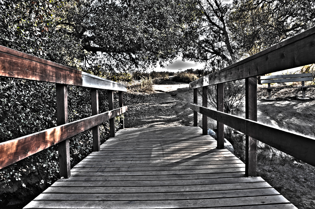
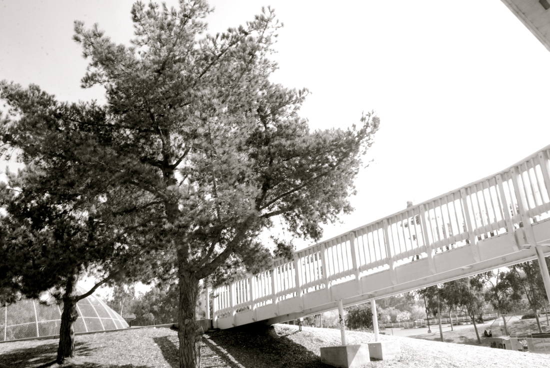
Julia Benitez, Class of 2014, "The Bright Side." I called my picture "The Bright Side". I named it that because on half the bridge you can see the color and on the other it's black and white. It shows that there is always a bright side even on the cloudy days. My main subject is the bridge. I was aiming for leading line. I really love this picture because there is a colorful side and a grey side and you can really see the textures. For this picture i used the automate. once i clicked in that i adjusted the saturation and the shadows. This is an HDR picture which means High Dynamic Range. It's many pictures put together in different exposures. Once you put them together you can really see details.
Mauricio Bernal, Class of 2014, "4 Seasons Project." The four seasons project was my favorite thing we have done this year. I thin this type of project was quite advanced because we took a regular photograph and created it into the four different seasons. The winter part of the image looks snowy the spring season looks rainy, the summer part looks bright and sunny, and the fall season looks dry with falling leaves. I took this photograph by the baseball field. I was aiming to get a large perspective so that the changes can be seen easily. I like it because you can see that i put a lot of effort into it and that i really tried my best to make the photograph look its best. In photoshop i did a lot of the work like cropping and making each season its own touch ups like making it more saturated and making it darker and also making it look like the leaves are falling. Over all i think this is my best photograph, i put a lot of effort into it and i think it payed off because I'm satisfied with the results.
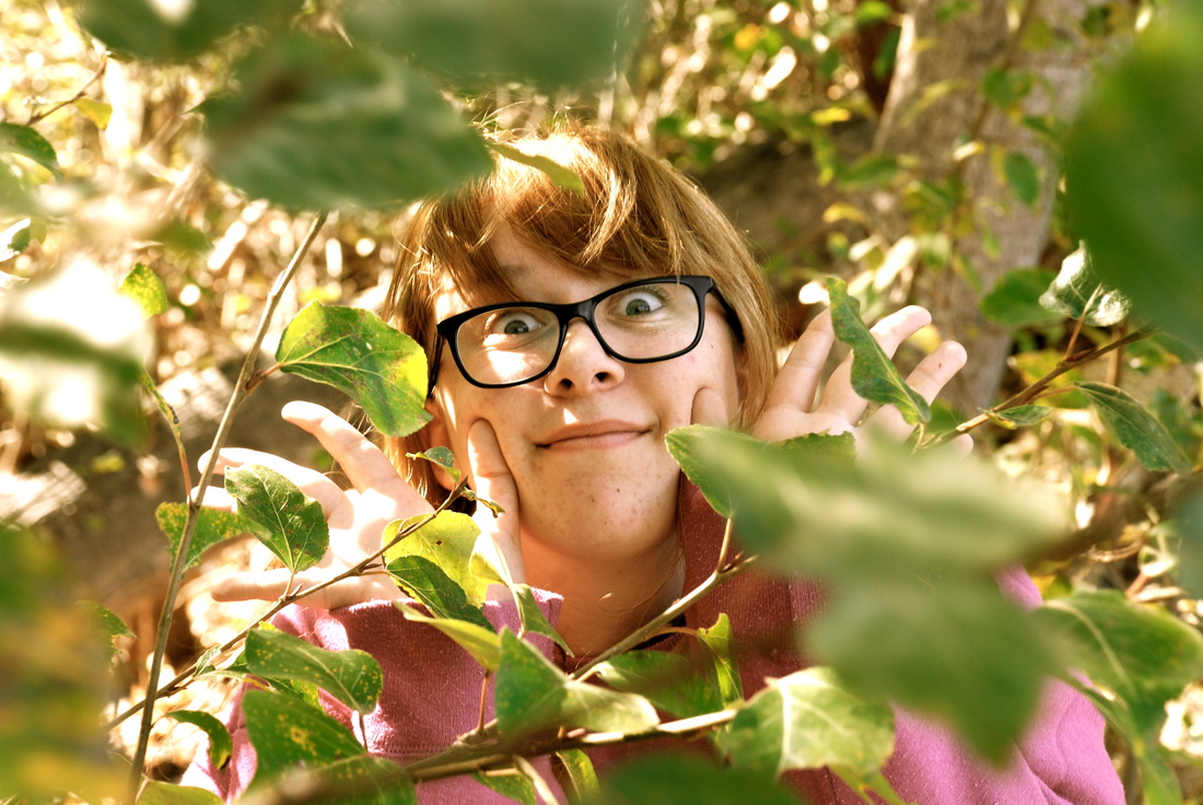
Hazel Blanco, Class of 2014, "Peek a Boo." I titled this work of art "Peek-A-Boo" because, as you can see, my model Karen is peeking out of the leaves as if she was playing "Peek-A-Boo"! I took this photo near the duck pond in the trees just the left. The main subject in this photo is Karen peeking out from behind the leaves. What I was aiming for when taking this was to get a sort of "surprise!" affect. I like this piece of artwork because it reminds me of all the fun times I had working with Karen and because it's just so quirky and different. I am choosing this one to be submitted into the gallery because it just sort of brings joy or a sense of happiness when you look at it. What I did with this photo in Photoshop was just to enhance the color and the saturation of the photo.
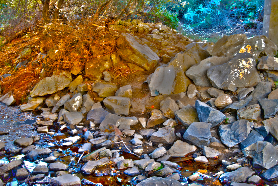
Zach Blunt, Class of 2014, "Water Under The Bridge." I named this photo "Water under the bridge" because it was taken under the bridge at the duck pond. The main subject of this photo is the rocks and the water flowing between them. I like this photo because of how the rocks have a somewhat metallic look and how the water has a green tint.
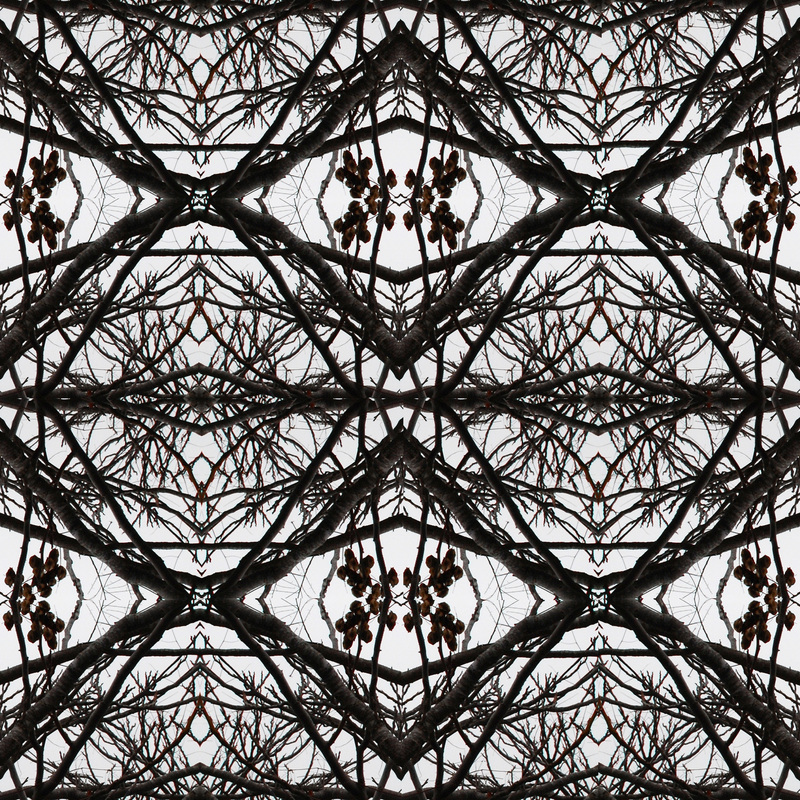
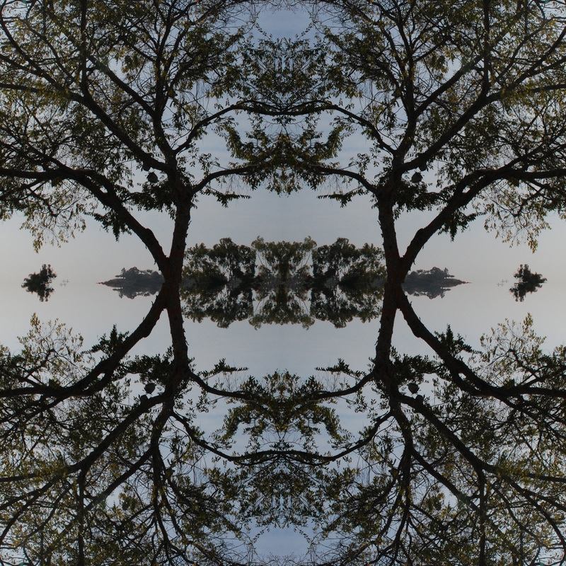
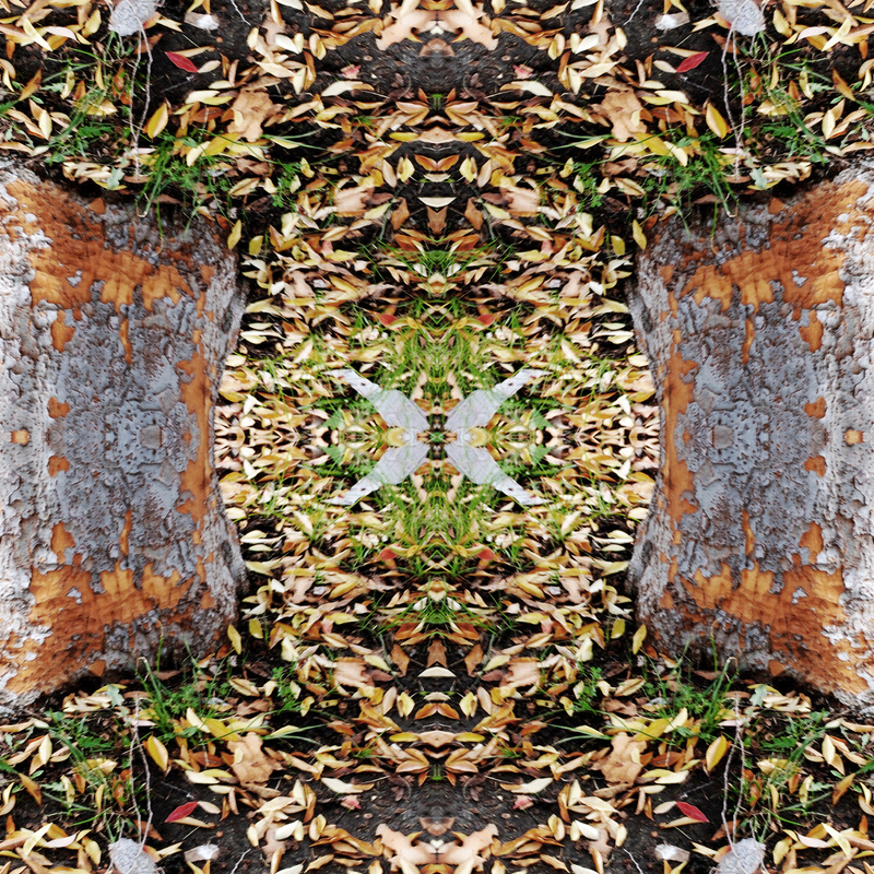
Jacob Brynie, Class of 2014, "Branches" I named the title of this picture Branches because of all the branches going different ways. I took this picture somewhere on the fire lane. The main subject is the branches going everywhere and connecting. In the original photograph the subject was getting the naked tree with the long branches. I like this artwork because when you create the mandala you can possibly find cool little designs. I chose this one because it was my favorite of all of my mandalas. In Photoshop I used the crop tool and then copy and pasted it and then rotated the pictures horizontal and vertical to create this photo.
Timothy Bunda, Class of 2014, "The Four Faces of Nature" The title of this photograph is "The Four Faces of Nature". This is a part of our Four Seasons Landscape activity. I decided to title it "The Four Faces of Nature" because of the different types of season presented in this photograph. From left to right, you can see "Winter", "Fall", "Summer", and "Autumn". I took this photograph at the patch area where there's a lot of trees. I used the trees as my subject here. From the left side, you can see the winter season. I added some snowy effect and changed the tone of that part into a cooler shade to evoke that feeling of cold winter feel. For the second half from the left, you can see the fall season. I added some rain drops effect and changed the tone of that part into a more gloomy/cloudy hue to get that effect of a rainy day. For the third part from the left, you can see the summer season. I just saturated the color toning of that part to make it more sunny and added spots of violet to the bushes to add an effect of blooming flowers. For the last part at the right side, you can see the autumn season. I basically changed the toning of that part into a red/orange hue to give that effect of the autumn season. I also added some falling leaves for the finishing touch. I like this photograph because I believe that I did a great job editing it into 4 different looks. I like how it turned out looking realistic. I used Photoshop to edit this photograph. What I did is I divided it into 4 different sections. After that, I started editing each and every section with different kinds of seasons. I focused more on editing the toning/hue of each sections to make a perfect color of each seasons and I just added some effects for the finishing touch.
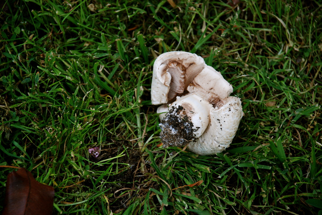
Brianna Cabrera, Class of 2014, "Removed." I titled this "Removed," because the mushroom was kicked out of the ground. I took this photograph outside of Mrs. Moncure's classroom (Room 231.) The main subject in this photo is the mushroom, it's been kicked out of the ground with the grass left looking healthy. I took it because I thought it was interesting that only the mushroom was harmed. I liked this photograph because of how clear it came out and the realization with it. I chose this for the gallery simply because I quite liked the photo, no real reason. I didn't edit this photo in Photoshop, I left it original.
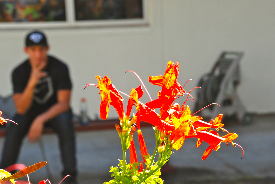
Ivan Canseco, Class of 2014, "Behind The Flower" I named it this Behind the Flower, because, even though the main subject is the flower there is more to the photo in the background. I took the photo at the garden near the weight room. The main subject of my photo, is the flower. The photo shows a red flower in full focus and Francisco out of focus in the background. I was aiming to get the subject in full focus and the background out of focus. I like this photo because I really like how the colors stand out and how vibrant the colors are, on the flower. I'm choosing this photo because I think it's one of my better photos I've taken. The steps that I used on photoshop, were just adjusting the contrast, brightness and use the clone tool to clear dust spots on the photo.
Alex Caro, Class of 2014, "Positive Balance." I call this "Positive Balance" because the photo has a positive message in my opinion and its balanced because of the trees. The message to me represents nature at its best and the and can be motivational by overcoming the hill and find out what lies ahead. I took this photo at the duck pond. The main subject is the two trees showing symmetry. Nothing is really going on in this photo. I was really trying to go for peoples different interpretations of this photo. I like this artwork because of the HDR effect i got to use on this; It makes it stand out and the colors are beautiful. I chose this one because its personally my favorite. I had 5 photos of the same subject but different lighting and merged them in photoshop using the HDR effect. Then i edited the color to get what i want, a warm setting to it.
Jocelyn Castellanos, Class 2015, "Vibrant Path." I call this photo vibrant path. I titled it vibrant path because of all the color in it. It makes it look inviting, hopeful, and full of life like if you follow this path it will just lead you to this great and beautiful better place. I took this photograph at the duck pond and what I was aiming for was to make the main subject which is the path to appear peaceful and just make the person who sees this photo wonder about this path and where it leads. To create this photo I merged it to HDR and made it more saturated.
Giovanni Castillo, Class of 2014, "Mandala" This is my mandala. I took this photograph right outside the classroom of a bush with a bunch of flowers. The main subject of this photograph is the flowers from the bush. I was just aiming to get most of the flowers in the shot so you can see all the detail in the flowers. I like this artwork because it looks very unique and cool and I like it because it's one of my favorite projects. In photoshop all I did was make a grid with the rulers and then I put in my picture and duplicated the layers a couple of times and flipped them all horizontally or vertically.
Uriel Cervantes, Class of 2014, "Duckpond Portrait." The title name of this project is duckpond portrait. I took the photograph at the duckpond at a bench. This year we've done so many different projects and assignments. The subject was my classmate and I took the picture while someone was holding a reflector by her face. I was aiming for a clear shot of her. I like this artwork because it's simple and it's nice. In Photoshop I used the spot healing tool and that's it.
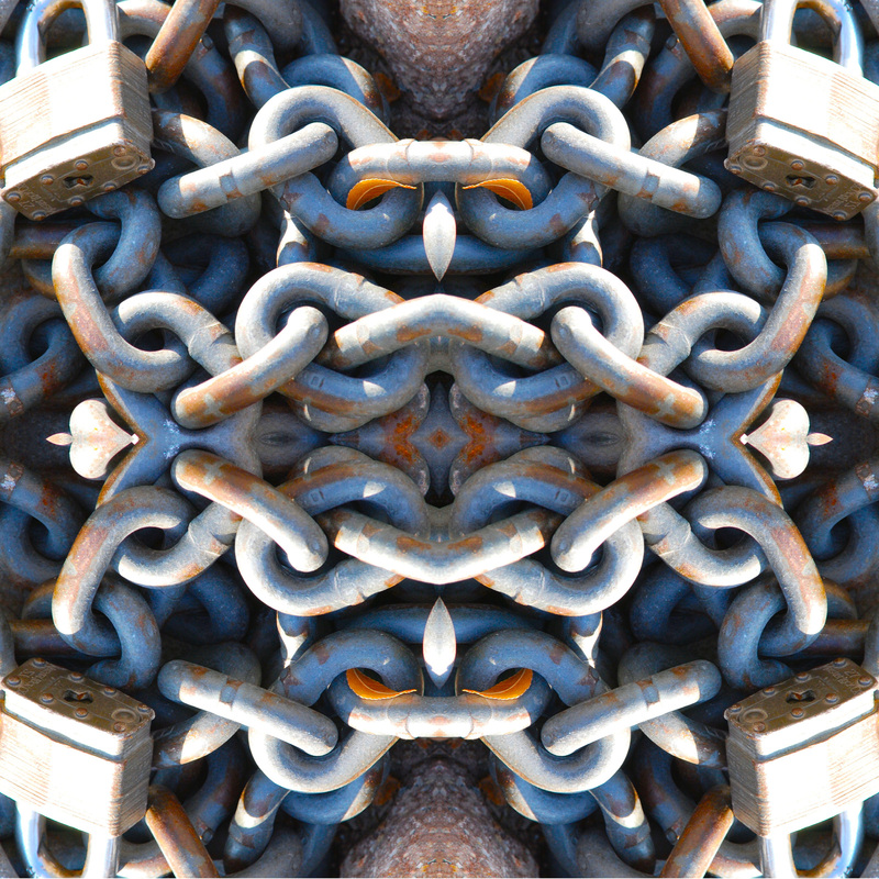
Jack Chilton, Class of 2014, "The Chain Knot." The title of this photograph is The Chain Knot. I chose this title because I feel like the picture really resembles a complex rope knot. This was also taken just on top of one of the staircases in front of the 800 halls. The main subject of this photograph is the chain, in the original picture it was actually just one strip but after it was edited it looked like a full jumble of chains. The reason I chose this one in specific was because the way it looked after being edited made it seem like it was all one big chain and each aspect was real. I also found it cool that it resembled some type of a knot. The only editing I did to this photo was turning it into a mandala by duplicating and flipping the photo 4 times. Also I added a little saturation to give the dull colors from the chain as much vibrance as i could.
Pedro Contreras, Class of 2014, "Roses of Terror" It's titled this way because my mandala looks like a bunch of spiders. I took the photograph at school and aimed for the beautiful pink roses. I like this artwork because I havent seen a mandala like this one. The steps I did were to use many layers and cropped out photos.
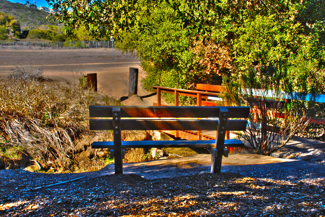
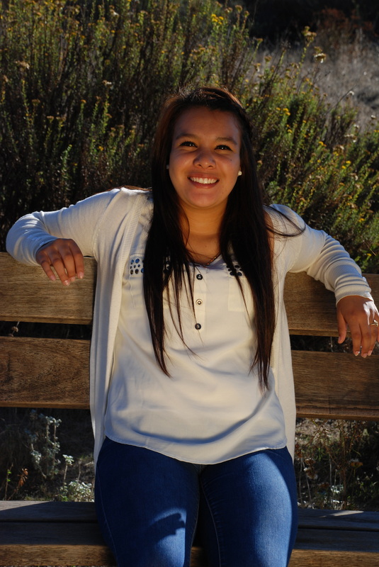
Daniel Cortez, Class of 2014, "The Bench." I took this photograph at the Duckpond near Rancho Buena Vista. I titled this photograph "The Bench" because the bench in my photograph is the eye of attention.The main subject of the photograph i peacefulness. I like this photo because all you see is a bench facing towards the peaceful landscape out front. I chose this photograph to be submitted to the gallery because I really like the colors and contrast in the photo and the shading that is on the picture as well.
Justin Cruz, Class of 2014, "Hazelnuts." I call this photo Hazelnuts. I titled it Hazelnuts because her name is Hazel. I took this photograph at the duckpond. The subject is Hazel and this was the framing photo for HDR. I chose this photo because I like how the picture looks overall mostly with all the trees surrounding her. To create this I had to take 5 pictures of same thing with different exposures and in Adobe Photoshop I merge the layers together and add saturation to get it how it is.
Francisco Curiel, Class of 2015, "V for Victory." I titled this photograph "V for victory" because the branches in the trees form a V. This photograph was taken at the back of the duck pond near a lake and there is a lot of trees next to each other. The main subject in the photograph is the V in the trees. I was aiming for symmetry and i also thought all of the branches and trees would look really good in HDR. i really like this art work because it looks very nice in HDR and is unique in a way. I chose this to be submitted in the gallery because it really pops pout more than any of my other photographs and i really like HDR photographs and the colors it can create. the steps i used in photoshop was very simple i just took my five photos and made it into one, then i used "saturate" tool.
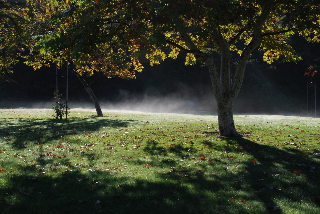
Brian Davis, Class of 2014, "Duckpond and Trees" The title of this artwork is Duckpond and Trees. It is called this, because it is at the Duckpond in the morning and it is of trees. I took this photograph, as you can tell, at the Duckpond. The subject in this photo is the trees and the morning mist. The mist is moving around, because of the damp grass and it was cold outside. I was aiming for the middle of the two trees to get the best shot possible. I like this piece of artwork, because it is one of my best photos this year, which is also why I am submitting this to the gallery as well. I did no photo edits in photoshop, only enhancement in iPhoto.
Samuel DeLuna, Class of 2014, "Up Close." I call this photo up close. I titled it up close because of how Jack had his camera pointed towards mine and I got it up close and I think it looks really cool especially with the grey in it. I took this photograph next to the football stands by the bottom stairs and made the main subject the camera and Jack. I fixed this photo up from its original photo by turning it to grey, used the focus tools to focus more on the camera and person and I think it looks a lot better now then the original and it's probably one of the favorite photos I've taken.
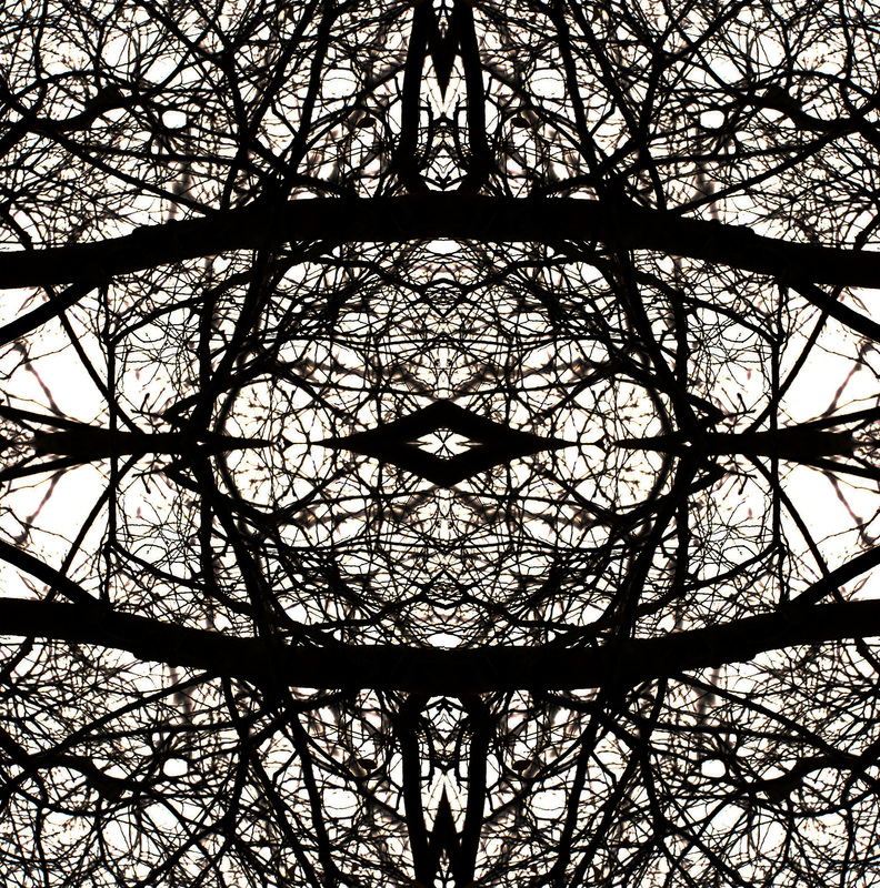
Vanessa Diaz, Class of 2014, "The Eye". I titled my photograph The Eye because my mandala of branches turned out to form itself into an eye. I took this photograph at school, and focused on some random tree branches. My main subject was the branches and there were a lot of spots i could've aimed for but chose the dying branches. I wasn't really aiming for anything in particular but I thought in the end it'd come out looking pretty interesting, and it did. I like this photograph because the branches formed into an eye and i like to see the smaller thinner branches in the background. I chose this photograph because I really enjoy this photo a\and i believe other people will as well.The steps I used in photo shop was the template so i could have 4 squares, and then rotated them all to be opposites of each other and edited the brightness and contrast of the photo.
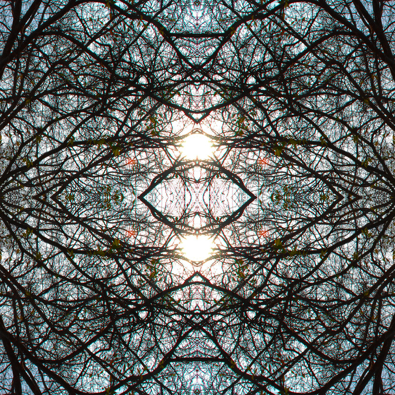
Kristina Dudich, Class of 2014, "The Tree Of Orbs." It's titled "The Tree Of Orbs" because the sun looks like orbs peaking through the branches. The photo was taken in the quad. The main subject is the sun peaking through the branches. I wasn't really aiming for anything specific I just thought the sun looked nice through the branches and it came together like that. I like this photograph because i like how the colors go from light in the middle and progressively gets darker and its in a pretty pattern. First I changed the image size to the height 8' and width 12' then I cropped it 4 by 4 and used the ruler tool to make the mandala puzzle and I placed them in each square and transformed each photo to the appropriate angle so it looks symmetrical.
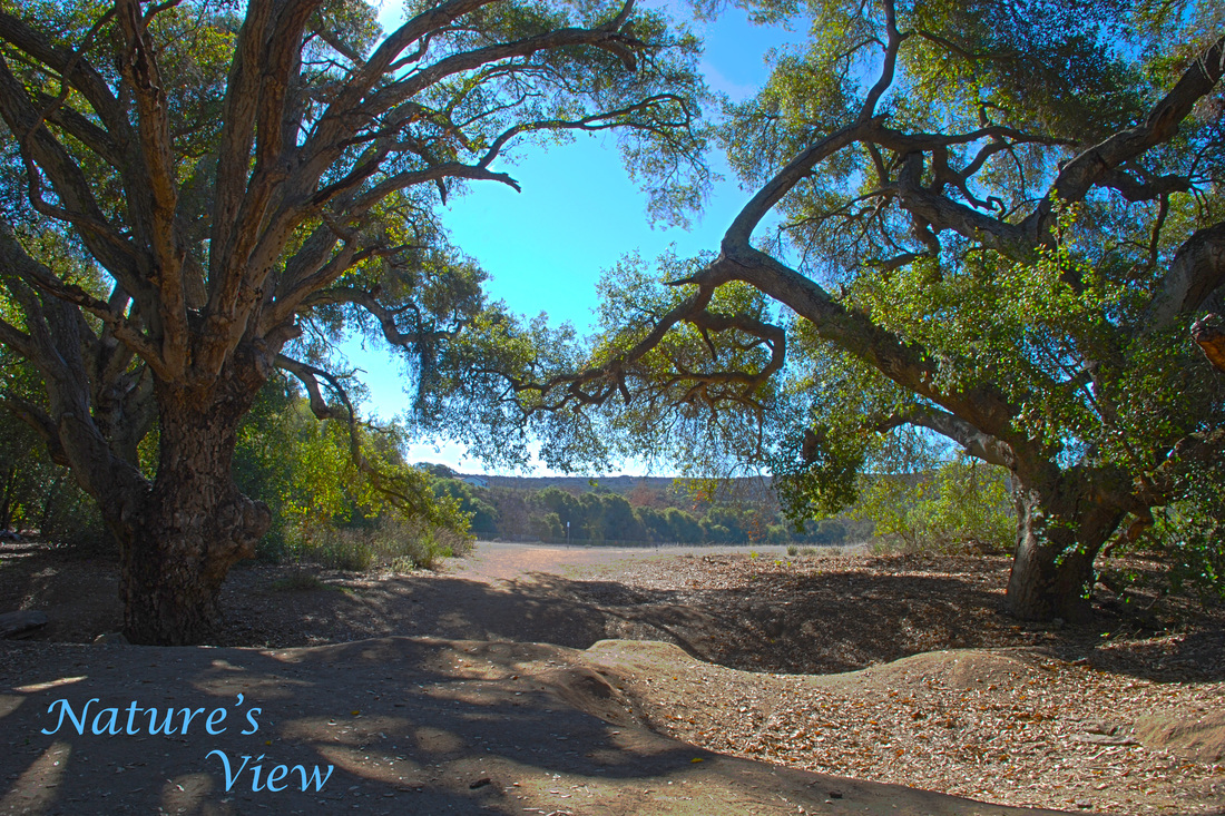
Whitney Earlye, Class of 2015, "Nature’s View". I decided to name it that because it’s such a beautiful picture of nature and it brings all the colors that are in nature out and shows how well they all go together. I took this photo when we went to the duck pond to take HDR pictures. It was taken toward the back area of the duck pond on the path back there. This photo was a last minute thought I was trying to figure out what I could take a picture of that shows symmetry. I think this photo is a great example of symmetry because the trees are about the same height and width. The subject in this photo is obviously the trees. I really like this photo I took because there are hints of blue peeking in from behind the trees. I also like how you can see the details in the trees, and I think it is just an overall beautiful picture. I decided to choose this one to put in the gallery because it is one of my favorite photos that I took. I had to put the photo in photoshop and turn it into a HDR photo so the contrast would really show and that the whole picture had the right amount of light and dark in it. After the photo was finished becoming a HDR photo, I had to use the spot removal tool in Adobe Photoshop so that there wasn't any dark spots in the sky or anywhere else in the photo. Overall it was a easy photo to edit and was one assignment that I really enjoyed doing and that's why I choose this photo.
Chris Egoavil, Class of 2015, "The Infinite Tree." The title for this is the infinite tree because of how there's no end to the tree what so ever throughout the picture. I took this photograph of a tree in the quad area. The main subject of the picture is part of the tree, the branches. I was trying to aim for the whole tree but it was to big to fit on the camera so I took part of it. I like this artwork because of how it looks so alive in the photo and I want to submit this because I want other peoples opinion on it as well. I cropped out a part of the tree to duplicate it in another file, after I just rearranged the photos to fit each other to make one single infinite tree. After all of that I just brightened the picture more and their was the final result.
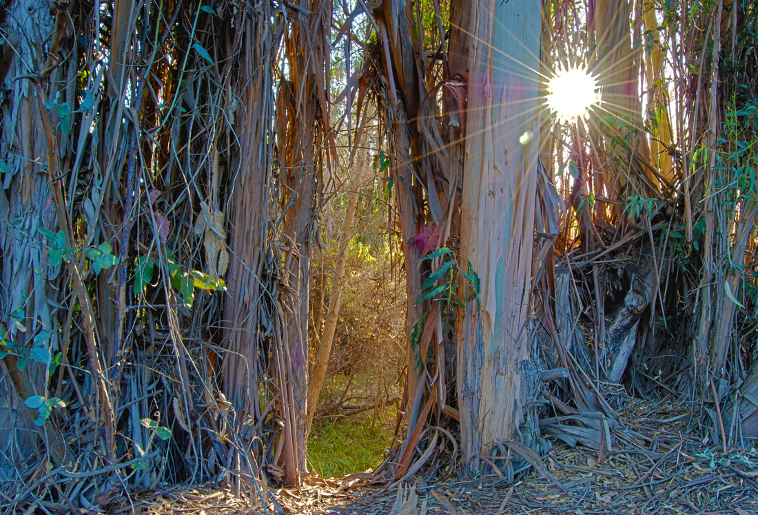
Eliot Ehrler, Class of 2014, "Through the Lines". I titled this artwork "Through the Lines" because of the beautiful sunlight that is shining through the lines of the trees and shrub, and because of the distant background being framed by the lines of the trees. I took this photo at the duck pond while we were shooting our HDR, High Dynamic Range, photographs. The trees at the duck pond are lined up on the side of one of the back trails, and I seemed to capture just the right amount of sunlight while it shined through all of the trees. I was aiming to capture the frame that the trees created around the distant background. While my main goal was to capture the frame image, I like the way it captured the sunlight more. I really like this artwork because it was one of the few that I have created this semester that really stood out to me. I have only participated in two of the photo assignments, so I did not have many photos to choose from, but I really like this finished project. I like the way I edited the photo in photoshop to add detail to the trees, the leaves, and the framed background. Overall, I think this is one of my favorite images and will probably continue to be one of my favorites until the end of the year. I had to add my own flavor to this image to make it just the way I wanted it to. In Adobe Photoshop, I used the Merge to HDR edit to add the same five images that had all different exposures. Once photoshop created the merged photo, I used the editing tools on the side tool bar to add contrast, saturation, vibrance, gamma, and sharpness. I adjusted each editing tool to make the color of the leaves stand out, to define the tree branches, and to create the overall visual of the photograph.
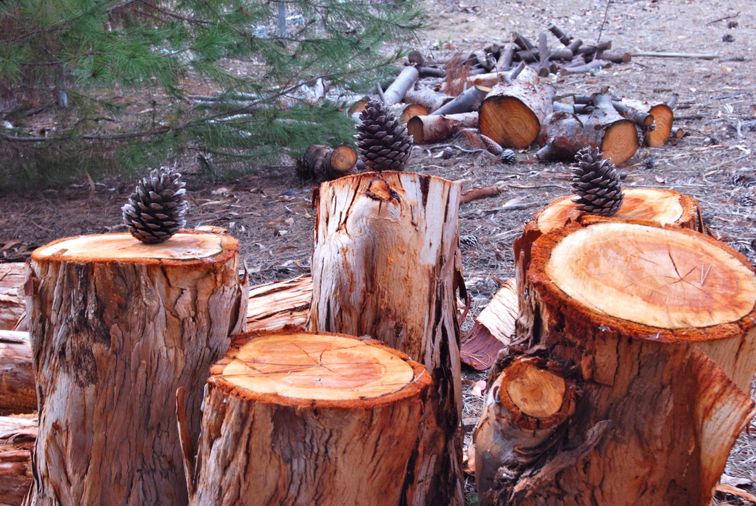
Shayda Ekhlassi, Class of 2014, "Pine Cones." The title of this artwork is pine cones. I named it that because I found some pine cones that I set on some logs. I was lucky enough to take this photograph at school, by the stadium next to the trees. The main subject is the pine cones, it's unique because it's the focus of the photograph. It immediately catches the audiences eyes. I also was aiming for a nature type setting with all the trees being surrounded. I really like this photo because it doesn't even look like I took it at school. It has a nature type feeling to it and it's different from most peoples. Only technique I really used was taking the photo at eye level and on photoshop increasing the brightness and a bit on the contrast.
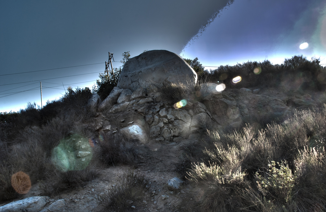
Sahra Emadi, Class of 2014, "Dark Night." The title of this artwork, is Dark Night, because the rock gives off a dark appearance. The photograph is reflecting a dark and luminous aspect. I took this photograph at the Duck pond, for our HDR photography project. We took our pictures based on the photographer, Trey Ratcliff. The main subject in this photo, is the rocks that are jumbled and stacked up on top of one another. In the photograph, there is a strip of light shinning through the dark image. I was aiming for the rough, jagged, texture of the rocks. I like this artwork, because you can see every detail within the photo. I chose this one for submitting to the gallery, because I think this is one of my best creations. The steps I took in Adobe Photoshop to create this artwork; was to merge all the exposure of this photo to HDR Pro. Then the technique I used to achieve this artwork, was changing the effects to make the picture more saturated.
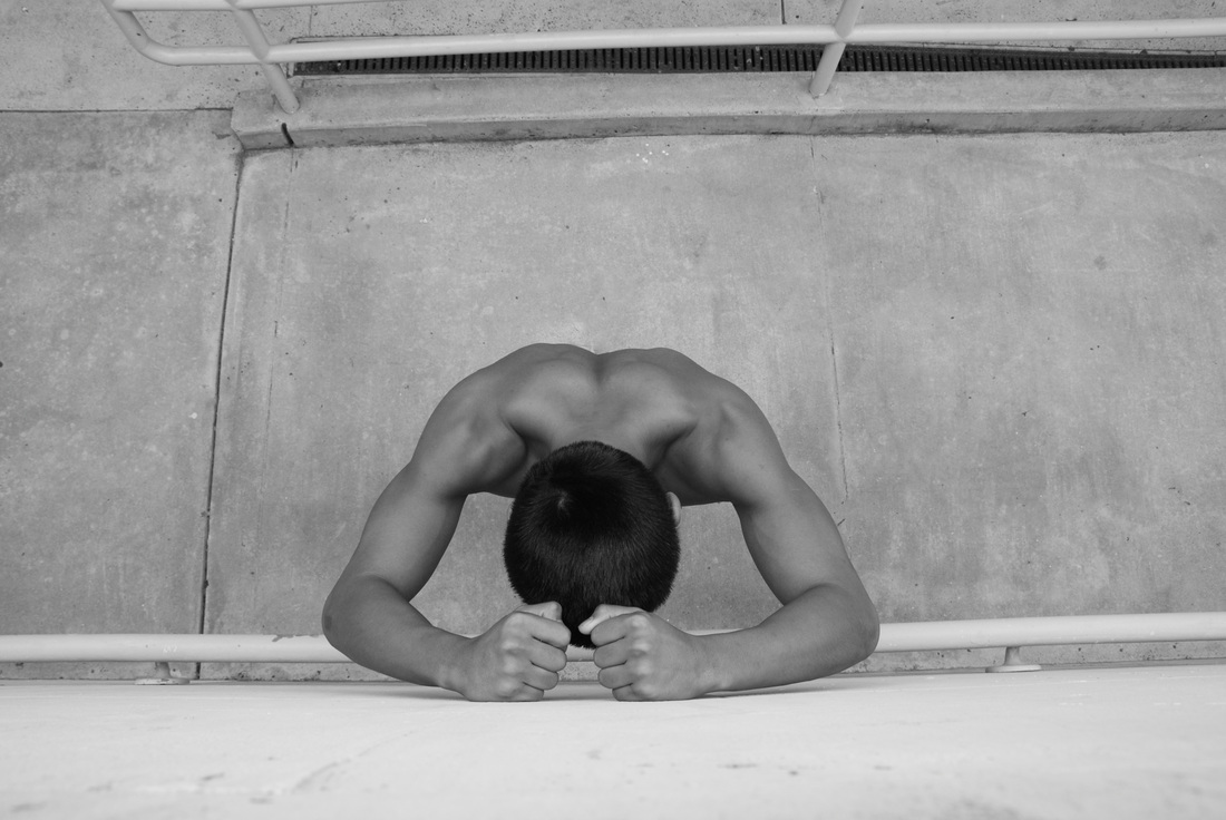
Mariah Florence, Class of 2014, "I Can Make It" The title of my photo is I Can Make It because the photo gives off a sense of giving up. I took this photograph at my high school, Rancho Buena Vista. I was above the subject and he was stand below on one of the ramps at the school. The main subject of my photo is the model, Ashley. In the photograph Ashley is leaning his forearms against a wall and looking down. I was inspired the photographer James Nachtwey. He has a similar photo to this of an African American man in a prison camp. In this photo I was aiming for it to give off a sense of motivation, strength and perseverance. I like this artwork because it is simple but defined. To me it gives of what I was aiming. I chose this photo because I feel that it is going to be different from all the other photos to be submitted. I didn’t use any special technique to change the photo other than making it black and white and I got rid of dark spots that were on the floor using the band-aid tool in photo shop.
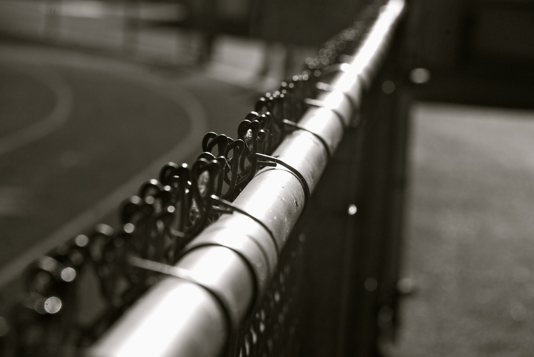
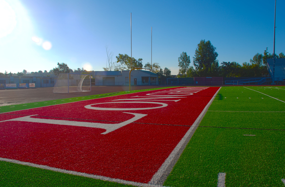
Mitchell Frame, Class of 2014, "The Gateway." This piece of artwork that I have posted is called,"The Gateway." The reason for this is because of the leading line that passes over a gate(fence) and separates two different types of terrain. (track & cement) I took this photograph within the first week of school right here at our very own Longhorn stadium. I took this photograph in order to show the concept of leading line and to separate two different types of terrain. The subject within this photograph is the fence down the middle. I like this picture, because it shows every little aspect of the fence detail while keeping a fuzzy background.
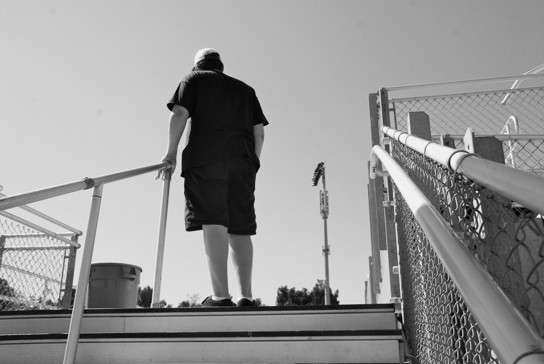
Toby Frias, Class of 2014, "Deep Thoughts." This is a photograph that I took of my model Samuel De Luna. Sam is looking out into the sky thinking about his life and how he can become a successful person. this photograph was taken at the RBV stadium during our vantage points session. This picture uses a front view technique. The main subject in my photograph is Sam. Sam is standing by the steps thinking about the stuff that's going on in his life. In the background you can see some of the stadium bleachers but most of it is taken up by the sky. I really like this photograph because the whole pictures comes together really beautiful and because the model looks really concentrated and thoughtful. I did very little to this photograph. I just cleaned it up and fixed the colors in iPhoto then I used photoshop to desaturate it.
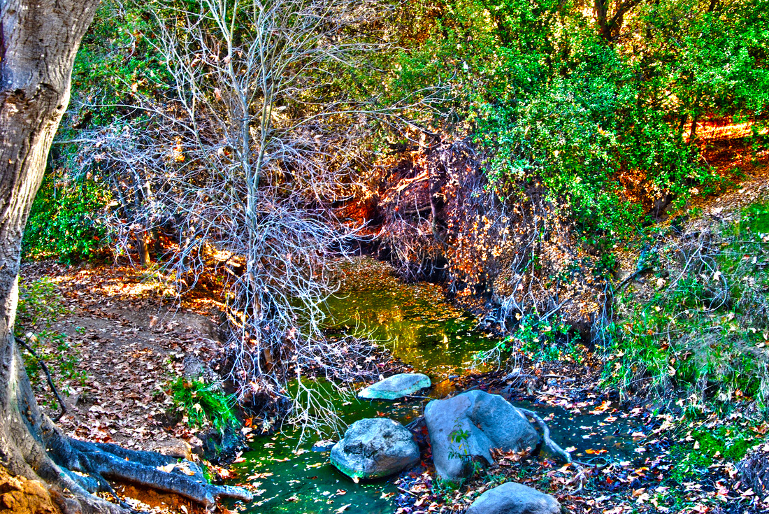
Jesus Galindo, Class of 2014, "Beyond Nature." The title of this photograph is "Beyond Nature" because of the way this creek looks more than just nature with its busy background and all . I took this photograph at the duck pond at some creek . I like this photograph because of the way the background came out even though I was aiming for the tree on the left to make it a rule of thirds picture . The steps I did in Adobe Photoshop were I automated to HDR pro . Then I selected and deselected the picture that came out best and not blurry . I then removed the ghost and finally edited whatever i needed to .
Eddy Garcia, Class of 2015, "Triplets." I named my photograph Triplets. I gave it that name because of how the three trees are symmetrical. They are equal in size and thickness. I like it because it has a great feeling of depth with the bright green leaves to the right of the photo. As your focus moves left you can see how the bigger trees in the background get farther. Another thing I really like about this photo is how it transitions from a shady area to a sunlit patch in the middle of all the trees. I was aiming to get a good example of symmetry. As you can tell by the title the subject has something to do with three objects and they are the trees. In like how the photo has a lot of shades of green, orange and gray. In Adobe Photoshop I used the HDR option to merge the original photos with different exposures to create a High Definition Resolution image. After the computer fixes the photos together into one, I changed the Gamma, Exposure, Detail and Edge Glow. There are also other settings but the ones listed have the most impact of the image.
Eric Garcia, Class of 2014, "Hallways." It's called that certain way because it's a picture of the hallways we walk through every day. I took this picture at my beloved high school, Rancho Buena Vista, in front of the library. The subject is the shadows. I like this photo because it's in HDR and I really like how its amazing and it takes photo editing to the next level. I used the healing tools so it doesn't have dust particles.
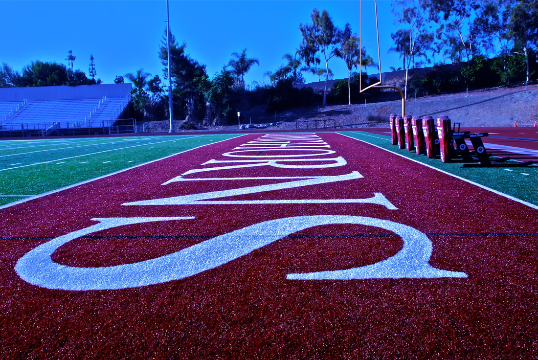
Marco Garcia, Class of 2014, "The Last Stand." The title of my photograph is called "The Last Stand" because this will be the last year that i'll step onto this field. This photograph is actually one of the first photo's I've taken in the beginning of the year when we did the leading line projects. The main subject would be the Longhorns end zone and i was trying to aim for it as well. I like this artwork because it has a lot of meaning and it shows that this is our last year here at Rancho. I basically just edited the colors in Photoshop.
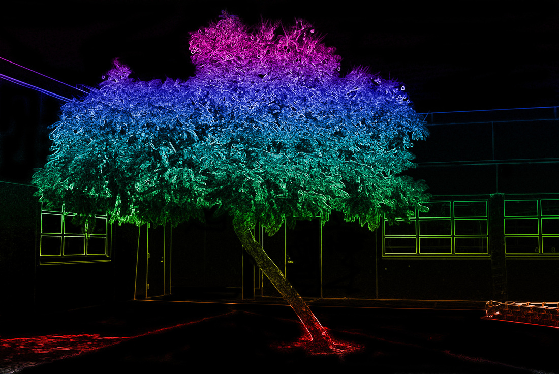
Celeste Giraud, Class of 2014, "Tree of Secrets." I titled this picture Tree of Secrets because the solarization filter gave it a mysterious quality that emanated the idea of simplistic secrecy. I took this photograph in one of the quads in Rancho Buena Vista high school. The main subject of this picture is a large, majestic tree that seems completely out of place in the mostly sterile school.
Eileen Gomez, Class of 2014, "Purple Dreams." Purple dreams:HDR I took the picture at the duck pond. my main subject is the bench and i was aiming for a surreal feeling. I think it really shows my skills. I choose this one because I just love the vibe it gives me. I used the lasso tool, the channel mixer tool, the contrast tool and the hdr merge at the very beginning.
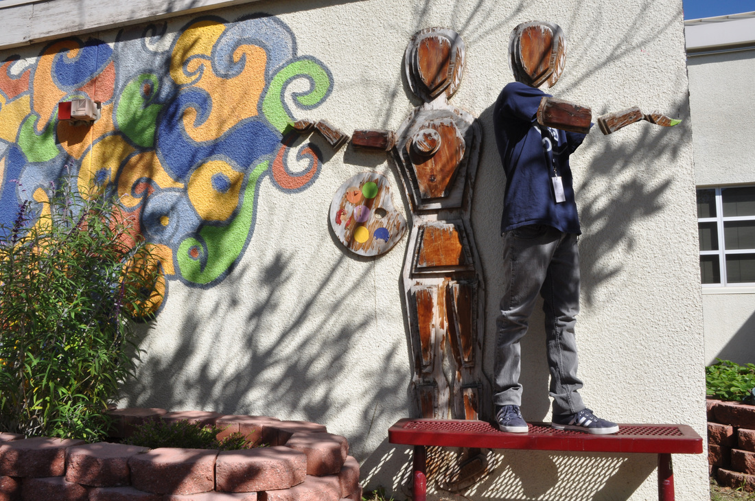
Karla Gonzalez, Class of 2014, "Fake Friends." The title of this artwork is fake friends because neither is real. I took this photo in the art garden next to the weight room. The main thing in this photo is my partner Ivan and the manicure of wood next to him. In this picture you can see a lot of different colors. I wanted to change some details of this picture so I decide to take Ivan’s head and hands off and have the same head and hands as the manicure. I like this artwork because I really work on it and try to make the two main objects look alike. I also like that this picture contains a lot of colors but doesn’t distract you from the main subject. I choose to submit this picture because is been one of the projects I like the most.
Reyna Green, Class of 2014, "Untitled." I took this photo in the quad. the main subject is the color of the flower, and I was aiming for you being able to see the color and with the green. I like this artwork, because it's different from anything that we have done. The steps i took were making a template, cropping the original photo and rotating it around to look the way it does.
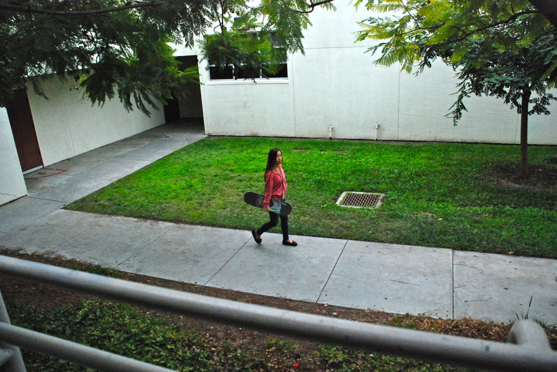
Trevor Handa, Class of 2014, "Off Guard." The title of the artwork is called "Off Guard" because it was a random photo that I took of Shelly and it wasn't posed for at all. I was taking pictures off people through the school catching them "Off Guard" and this one came out the best. I took the picture in the hallways at school between the 300's and 200's. The path and the green in the background set a really nice scene to the picture. The main subject of the picture is Shelly walking with the skateboard in her arm. In the photo Shelly is walking through the halls and I happened to snap a picture of her in the moment. I wasn't aiming for any certain type of shot it just happened when she was "Off Guard." I like this artwork because it was just natural and I didn't expect anything cool to come out of the picture but I think it looks nice. I am choosing this photo because I haven't used it for any project because it wasn't part of any project we were doing I just happened to take the photo. I didn't use photoshop for the photo I just enhanced the picture in iPhoto and added some definition.
Maxlynn Hargis, Class of 2015, "Tree Stump." The title of my tree is called tree stump, it is titled this way because it is a tree stump. I took this at the duckpond, I tried to mainly get detail in the tree and some background. I like this a lot because I really enjoyed doing the HDR and I think this is really creative and pretty. In Photoshop i had to browse for 5 pictures I took of the same picture and then edit it, as in take the ghost off and change the shades.
Chase Harn, Class of 2014, "Sun Rays." In this photo it shows my partner under a tree and the sun is right behind her but gets blocked by the tree and gives off a really cool glowing effect. I titled it sun rays because you can clearly see the rays of the sun through the trees and it gives it a really cool effect that is not easily captureable. I really like this picture and was surprised I took it. I took this photo over by the stage underneath one of the trees at a upwards shooting angle. In some of the photos, the sun was coming out of the trees way too much and gave too much exposure, so they were too bright. In this photo we were shooting portraits and Amanda used a mysterious look. I think this is one of the best natural photos I've taken in this class with no effects whats so ever. I didn't use Photoshop, this is just a photo that I took with the camera set in Program mode.
Aubrey Harris, Class of 2015, "Untitled." I took this at the duck pond, the main purpose of this photo was to capture the compositional technique of rule of thirds which was Clariza. I choose this photo because I liked the way it was set.
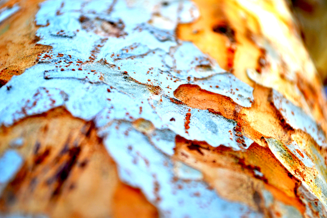
Reina Heddy, Class of 2015, "Tree Bark." The title of my work is tree bark, because it's of tree bark. I took the photo off one of the trees in the fire lane. The main subject I tried to capture was the different colors and the texture of it shedding. I like this artwork because it has colors orange and white that contrast nicely. I chose it because it simple yet powerful. I used auto enhance, color balance, saturation, and exposure.
Trevor Heldreth, Class of 2014 "Mandala" The photo is of a mandala. I took this photo in the quad. The main subject is a tree. I was going for a unique combination of shapes. I like this artwork because the shapes came together very well. I chose this one because it looks interesting. I simply changed the brightness and color a bit using Adobe Photoshop.
Clariza Honorato, Class of 2014, "Looking Ahead." I called this "Looking Ahead". I called it that way because my former partner Eric, was looking ahead, as if he were looking ahead of the road to his future and looking ahead with confidence.I took this picture by the student parking lot exit. In the picture you clearly see Eric as the subject along with some cloudy skies and some bit of the lot. I really liked this one because the way he looks, stands tall, and the way the affect all comes together looks amazing in one photo. All i really did was use the black and white affect along with some boots in it and also retouching it in order for no black dust in the sky showing.
Madison Irwin, Class of 2014, "Polka Dot Blues." This is one of my selective color photographs and I titled it "Polka Dot Blues" because I was trying to go for a more innocent of cheery tone/atmosphere. I took this photo at the duck pond, and the main subject of this photograph is Jessica dancing, and I was aiming for capturing her really contagious and fun personality. I really like this photo because between the polka dot dress and her dancing it gives an air of innocence and happiness thats contagious or sort of uplifting. The steps I took in photoshop was creating two layers of the photo then making both layers black and white and erasing her dress on the top layer so you are able to see the blue of her dress.
Bailey Ivicevic, Class of 2014, "Angel in Red." The title of this photo is Angel in Red. The reason why I chose this title is because when you think of an angel you would think that they would be dressed in white, but in this case his name is Angel and he is dressed in red. I took this photo at the duck pond when we were taking portrait pictures. The main subject in this photo is Angel. In this photo I was trying to catch him at the perfect timing to show his true smile. I was aiming for a natural pose and I think I did a really good job of capturing a moment at perfect timing. I love this photo because my favorite types of photos are those that have certain things in color and the rest in black and white to make them stand out. Also because, being his friend, I know when he is faking a smile and in this one I caught him with a real one while he was laughing. I chose this one to submit into the gallery because it is my favorite photo I have taken this year. In order to create this photo in Adobe Photoshop I had to first duplicate the layer so when I erased the black and white of the photo the red of his shirt would stand out. I erased his shirt only on the top layer and i was finished.
Amanda Johnson , Class of 2015 "Beautiful Whitney" The reason I named this photo Beautiful Whitney because in this picture she is smiling and she is showing feelings of how she really is as a person. I took this photo for the portrait assignment and I really like this photo because of she is posing in the picture and I like how it brings out the colors in the photo. To make this photo the way it is I just added more saturation and things to make the picture brighter and better.
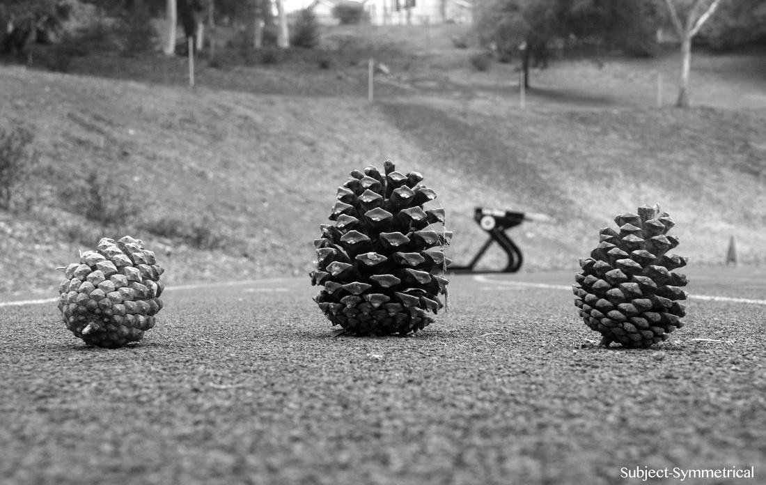
Shannon Johnston, Class of 2014, "The Three Cone-migos". I named it "The Three Cone-migos" because there are three pinecones. I wanted to name it "The Three Amigos", but that was not clever enough. So, I created a punny name, "The Three Cone-migos". I took this photo on the far side of the football field where the track meets the dirt hill. The main subjects are the three pinecones. They are in a row with the biggest one in the middle. I was aiming to make it look symmetrical, and look like a sort of pattern. I like this photograph because it looks nice and its very clear. The subject is very in focus, and it looks pretty good! All I did was upload the picture from the camera onto iPhoto, then changed it to black and white. Black and white made it look more crisp and clear.

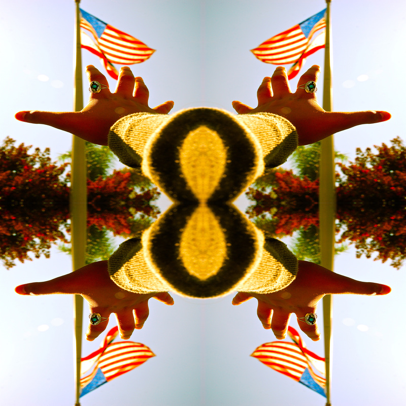
Eileen Jones, Class of 2014, "Hands of Hope." My photo, Hands of Hope, represents the American dream. As an American, I am always surrounded by many cultures and people with such drive to achieve their goals and because of that I have gained an acceptance for peoples differences and a desire to reach my dreams. The photo was taken with hands held to the sky exemplifying the idea that the sky is the limit for us as individuals and for America in general. The flag on the hands helps represent this all while keeping the sky within the background and helping blend the blues of the flag and the sky. I am truly proud of this piece because it shows my goal as a person, which is to achieve my dreams and ultimately help others achieve theirs. In Photoshop, I really had to work to make this picture exactly what I wanted. I had to mesh the photo of the hands and the flag photo together and then erase everything except the shape of the hands of the flag. Then, I added a more blue tint, and voila, a fabulous photo!
Yasin Khan, Class of 2015, "The Invisible Woman." I titled it that way because the photo is a woman who is invisible which is pretty self explanatory. I took the photo of her sitting on a bench in the halls. The main subject is my partner Camille whom I asked to sit on that bench. I wanted her look both relaxed and mysterious at the same time. After I captured the shot of her, I had to go through some heavy editing. I had to go on adobe photoshop and carefully erase any parts where skin was shown to make her appear invisible. This procedure was the most difficult because I had to get every little detail by zooming in close and carefully erasing those areas. Overall I am pleasant to see that I was able to make my partner invisible and to capture that certain essence of her. Story: There was once a women named Camille who had been cursed to never be seen for who she really is…. literally. She was an outcast from the world of high school, never to be accepted as a friend. All of the people would panic in fear and run away from her. She would always sit alone in lunch and try to enjoy her meal. Then she would just silently watch all the other people talking with their friends and just hope she can be like them. Then one day, after walking home from school. She encountered two people who did not run away, instead they pointed and laughed at her. All you can see was water dripping onto the ground and then she ran away with sadness. She always questioned why is it just her who cannot be seen and no one else. She needed to get to school after that day and just sulked it all up. School was the same, nobody would talk to her or be near her. Until later that day while just sitting on the stairs, she met someone. This person was invisible just like Camille! They just looked at each other and she asked to sit with her. Camille was filled with joy that someone actually wants to be near her. Her name was Ashley and the two became best friends. They didn't care about others because they had each other who understood each others problems and were able to relate to it. The rest of high school went great for the two and they did everything together. The two lived happily ever after, THE END
Letrina Keila, Class of 2015, "The Other Side of Nature." The title of this art piece is the art piece that I did in class it is called The Other Side of Nature. This photograph was taken at the duck pond by our school. The main subject in this photograph would be the trees because they are symmetrical which means that the trees are evenly spaced. In this photo not much is going on because the trees are very still and there is not much movement in the photograph. I think what I was aiming for was to show what the other side of nature looks like in all different shades of color and to show the many different perspectives that people have when they look at nature. I like this artwork because of the many colors there are and because of the things that I didn't see in the photograph or that I didn't notice. I chose this photograph because I thought that it was very unique and of the way the photograph tells a story. The steps to creating this is using HDR which means High Definition Resolution. First I did File then automate and then merge to HDR pro, after that I would select the photos from iPhoto and then I would open them, sometimes the photo would turn out blurry so then I would deselect the photo that made it blurry and then saved it as a JPEG.
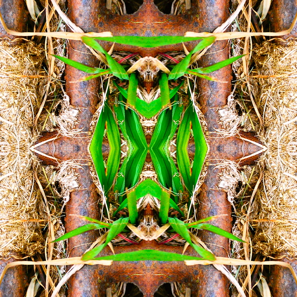
Katherine Kester, Class of 2014, "Green Rust." This artwork is titled Green Rust, the reason I titled it that is because of how this specific mandala contains both texture aspects of rusty metal and smooth green leaves. I took this photograph inside my school on the ground in the grass. The main subject is of a storm drainage manhole in the middle of grass. The green grass and dead grass is growing around the manhole and is also intertwined with the metal rusty bars. The main aim I was going for was to get all these textures and elements into the picture and create a cool kaleidoscope effect. The steps I took in Photoshop was enhancing the picture which is adjusting the saturation, contrast, brightness, hue and detail. Then I created sections to put the picture in and flipped them as I put them in specific places. This thus creates the mandala kaleidoscope effect.
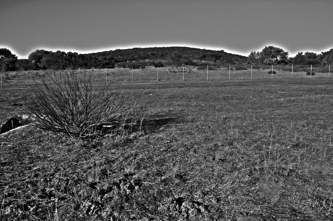
KeAudra Lathan, Class of 2015, "Highlights of the Landscape." I named the title of the artwork highlights of the landscape because the mountain and trees in the background have like a highlighted aurora above them. It stands out too because the picture is in black and white so the highlighted area draws your attention. I took the photograph at the duck pond close to Rancho where most of the landscape was withering away. The main subject was the dead bush on the left side of the photo and nothing is really going on in the photo considering the scene was quiet and calm. I was aiming to take a photo that has to do with the rule of thirds and I got this picture. I like this artwork because the photo actually came out pretty good and I like how the photo looks somewhat old even though it is in high definition resolution. I chose this one to submit for the gallery because I really like how it came out and I think it's one of the best photos that I have taken this year. The steps I took in adobe photoshop were first going to file and pressing automate so that I could merge to HDR pro. Then I changed the saturation and the vibrancy in the photo before pressing ok and clearing the spots off from the photo with the retouch tool in photoshop. After that I saved the photo.
Christian Laurel, Class of 2014, "Four Seasons." This is a picture called four seasons because it is simply all four seasons in one picture. I took this photograph at the duck pond. In this photograph i am dividing the photo into four sections. In each of the sections a different season will be placed. I like this photograph because how it came out with the colors describing each season correctly. In photoshop i used many different techniques to get this final project. The most important step was messing with the colors. LIke in winter i added color to seem like snow, and in fall i added leaves on the floor. I like how it is just one picture describing four seasons.
Grisell Leon, Class of 2014, "Wonderland." This is titled "Wonderland". Its titled this way because it's all mysterious in a happy way. It's a place were you can just sit and think about the happiest moments of your life. I took this at the Duck Pound. I was aiming for the leading line. I used HDR to make it look amazing.
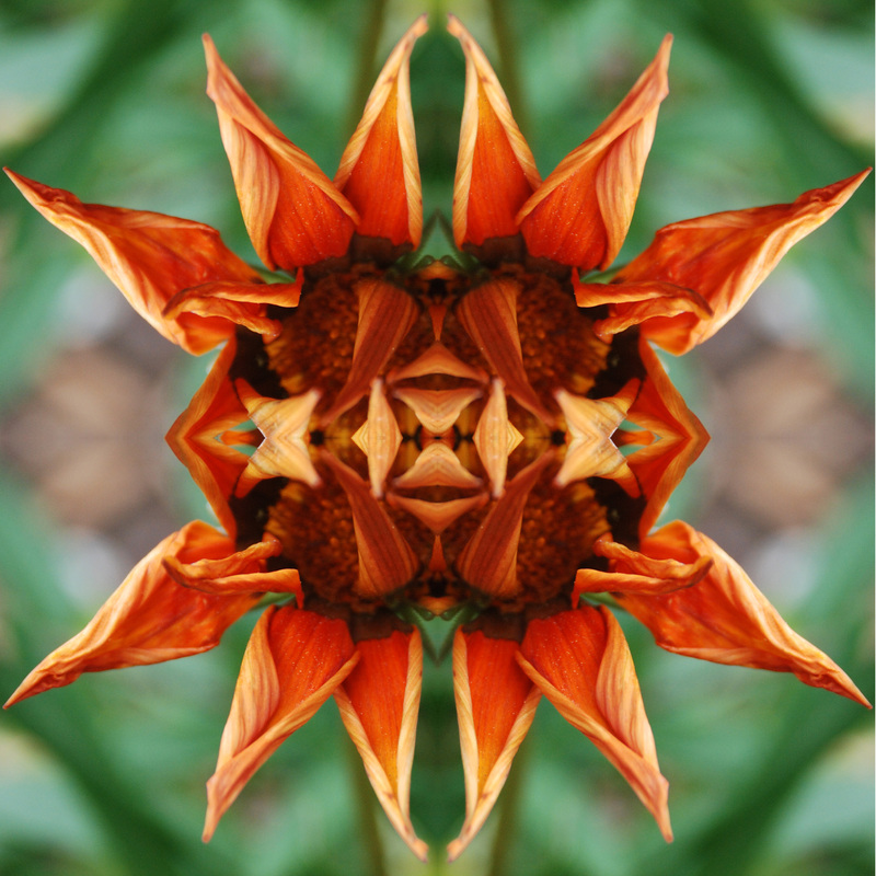
Victoria Mang, Class of 2014, "Focus on the Good." The title of this photo is called "Focus On The Good" because the flower is in focus and is the focal point of the picture. I took this picture at Rancho Buena Vista in the school garden. The main subject of the picture is the orange flower and I was aiming on a clear and detailed shot. I like this photograph because of the clarity and that the flower came out really pretty and that everything is aligned in the mandala. When editing this picture, I used photoshop. In photoshop, I took a white template and added 4" section in a 8"x8". Then I took 4" sections of the flower photo and added them into the 8x8 template and used either flip horizontal or flip vertical until the photos aligned.
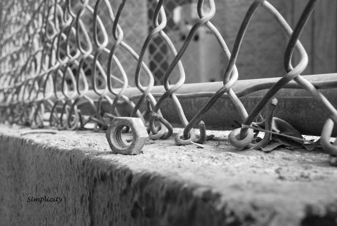
Ashley Lucas, Class of 2014, "Simplicity." Simplicity is the state, quality, or an instance of being simple. I took this photograph at a baseball field where I found a nut bolt on the ground. The main subject of this photograph is the nut bolt. The bolt is set on the edge of a fence base. In the image I was aiming for simplicity, hence the title. I was trying to portray that simplicity is the glory of expression and we have lost the contact with reality, the simplicity of life. “As I have practiced it, photography produces pleasure by simplicity. I see something special and show it to the camera. A picture is produced. The moment I held until someone sees it. Then it is theirs,” Sam Abell. I really like this image because it’s so simply and it can be interpreted in many ways because of its simplicity. I chose this photograph because it’s unique. To make this image I really didn’t do that much to it. I just changed it the color to black and white with a little cropping.
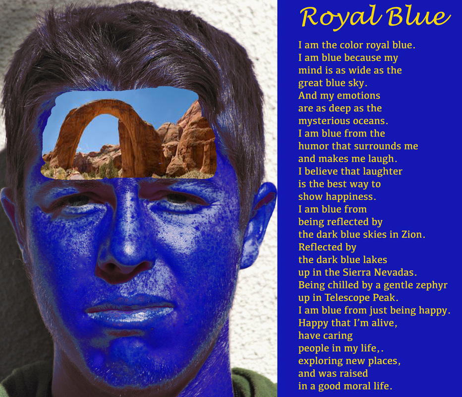
Alex Marr, Class of 2014, "The Mind of a Quiet Teenager." This picture is from my color self portrait project. The title that I gave is "The Mind of a Quiet Teenager." I call it this because I am a quiet person but I have a very active and imaginative mind. I took this picture in the area by the Finance Office. So the main subject of this project is to express ourselves with colors that represent our personalities and write a poem about it. I am obviously royal blue as you can see it. In the photograph I am just standing and staring at the camera with no expressions in my face, a typical look of a quiet person. But inside my head, my mind is having an imagination moment. Here I am thinking about Rainbow Bridge, one of the largest natural bridges in the world. In this picture, I was aiming to express myself through this picture that I created. I like this artwork because it is my most artistic artwork that I did so far. I chose this one to show everyone because the picture explains who I am and how I think. In Photoshop I erased my forehead and put the Rainbow Bridge picture inside my head. I then use change colors and change my skin color to blue.

Isaias Martinez, Class of 2014, "The Dove of Freedom." The title of my favorite project is "The Dove of Freedom". The title is this way because the dove on the image is a symbol of freedom. I took this photograph by the 200's hallway of a mural. The main subject is a dove flying by two hands together. I was aiming for the dove but I thought the two hands would make it look even better. I liked this artwork because I like the color and the meaning behind the image. I chose this artwork because was the best one I did and it represents freedom in our nation. The steps I used to create my artwork in Photoshop was to change the color, brightness and opacity.
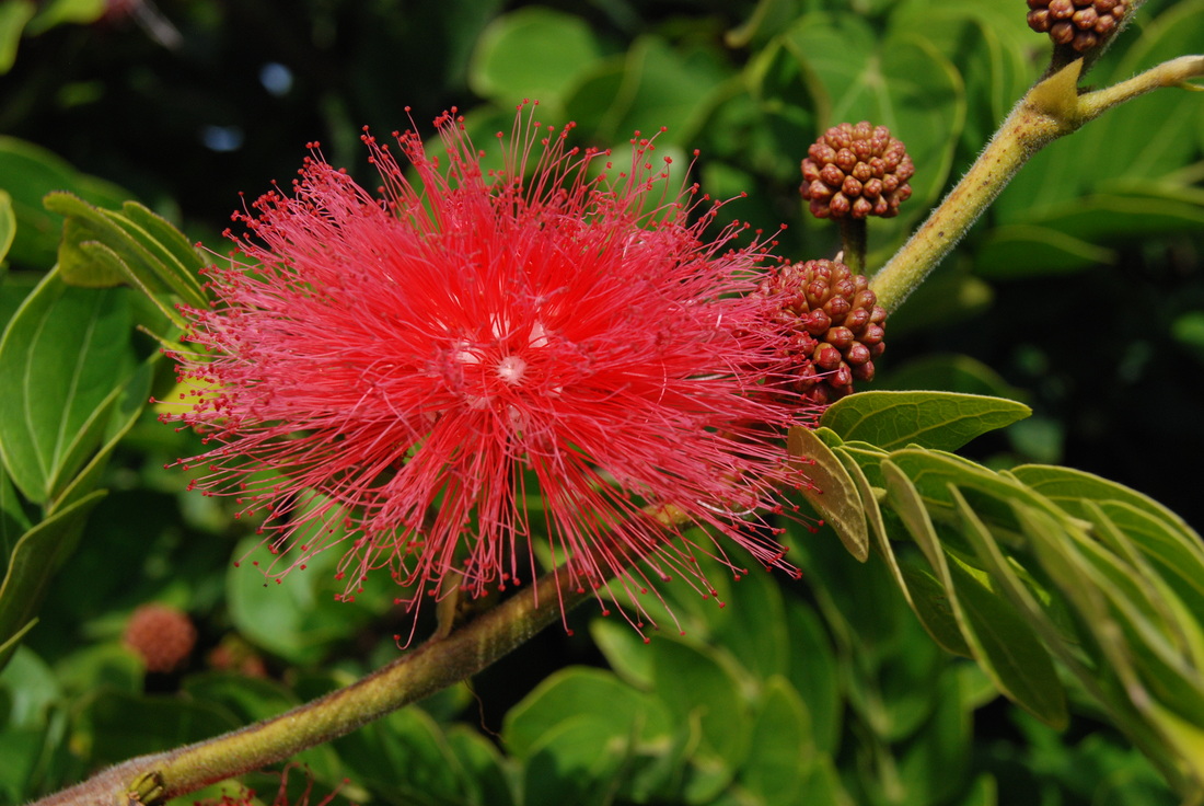
Manuel Martinez, Class of 2014 "Red Flower." It is titled that way because it came out really good and bright and its the best picture I have ever take. I took the picture by the stadium. Im aiming for the brightness and how even the seeds of the flower came out really focused. I chose this picture because i think it came out really good and thats what exactly what i was expecting. I didn't take any steps on photoshop thats how the picture came out (:
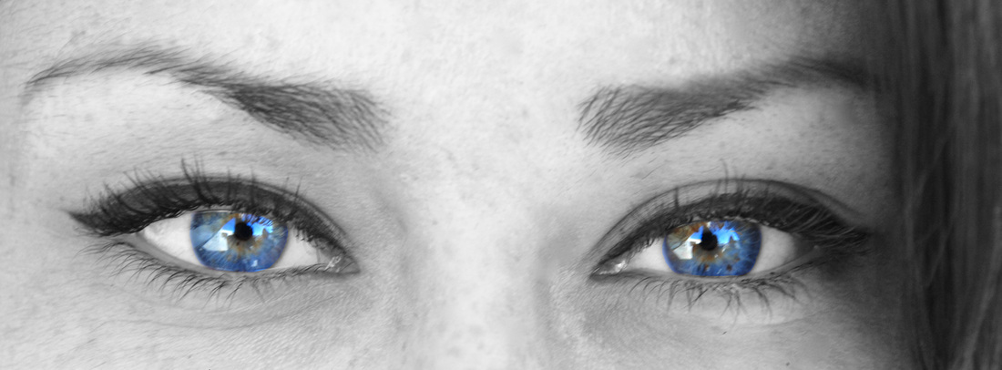
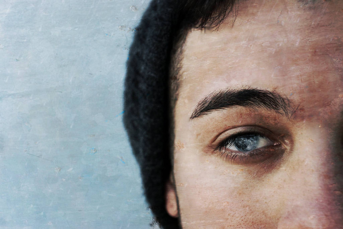
Alex Melendrez, Class of 2014, ''Blue Soul'' It's titled that way because of how blue her eyes are it makes me feel like im looking into her soul. My main goal was to really make her eyes pop out. I really like this artwork because it makes me feel like I'm looking into her soul. I used the erased tool to only have the color show on her eyes and I duplicated the layer to have one of the layers be black and white.
Daniel Meza, Class of 2014, "Untitled" I took the photograph at school, the main subject is my eye because it gets really good emphasis on it. I like this photo because it looks really original. The first step was to upload a photograph of the moon over my eyes and then edited it in a way that it looks like my pupils. Then I put a filter that I created myself in Photoshop.
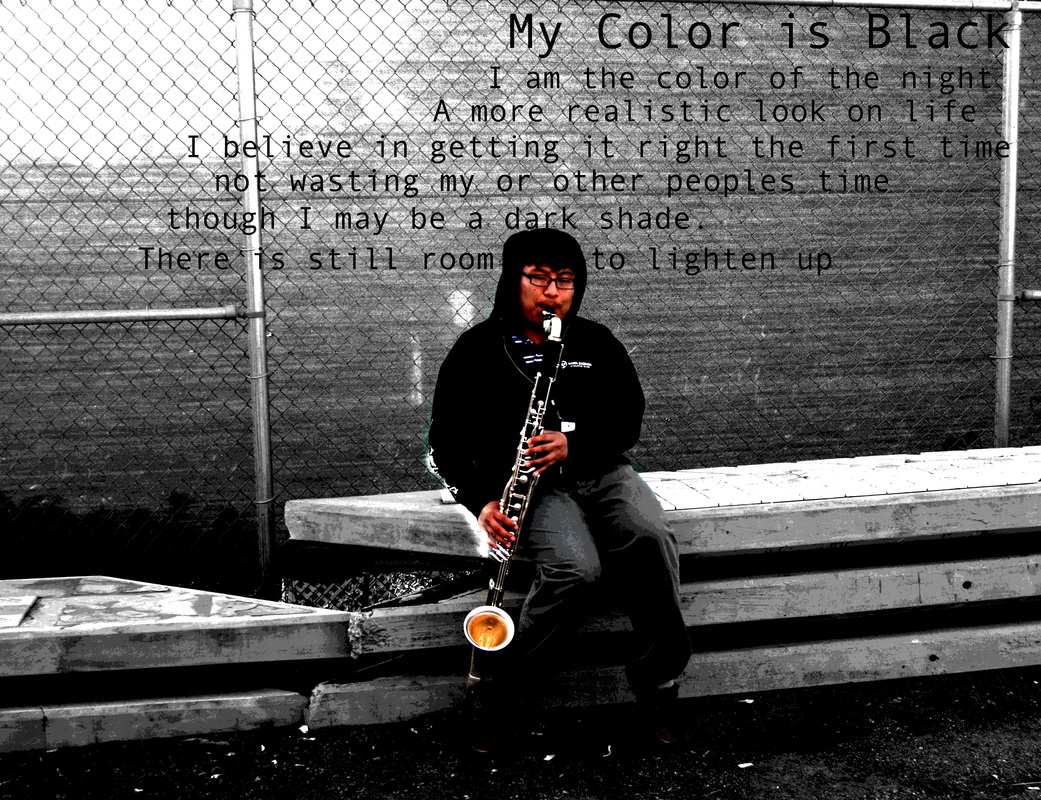
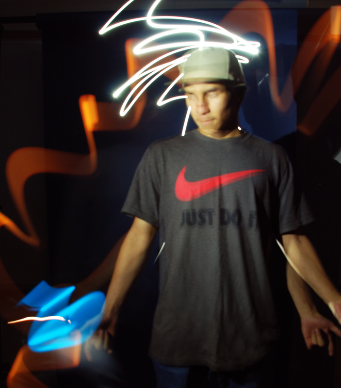
Benjamin Miguel, Class of 2014, "Untitled." I don't have a tttle for this one, it just happens to be a nameless photo. I took this picture by the stadium, by the end of the 700 wing. The main subject is me, I'm sitting playing my bass clarinet and posing at the same time, and we were aiming for a self portrait of me. I like this because it's about me and because it looks cool. I used a technique in photo shop where I take a way the color of the top layer and left the background with color that way I can erase some part of the top layer and can accent the subject of the picture by isolating the color.
Angela Milnes, Class of 2014, "American Pride." The reason I named my photo American Pride is because this photo represents hope and how America is the country of possibility were dreams can come true . I took this photo in front of the office at the flag pole . Overall I was aiming for a different look on life and to show people what America has done for us and how fortunate we are to live in this country . I chose this photo because its unique and I didn't see anyone else with this type of photo. While I was editing my photo in the Adobe Photoshop I learned how to move the photos vertically and merge the layers so it looks like multiple hands and creates a different look that I like a lot .
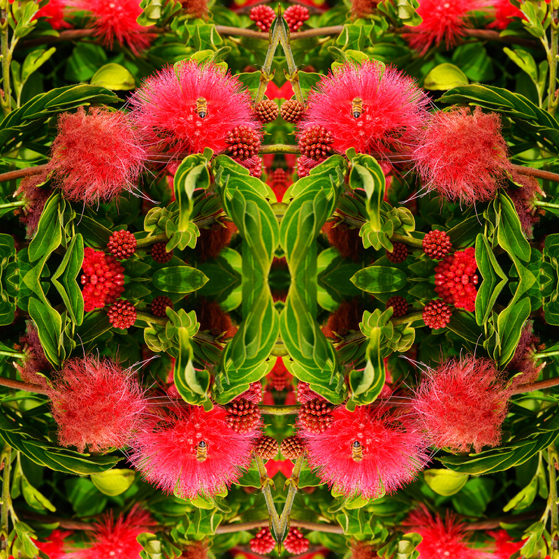
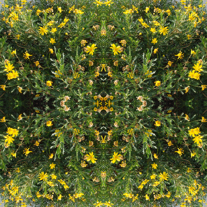
Kendra Molano, Class of 2014, "Beeandala." The photograph I decided to choose for the website was my mandala picture. I decided to name it Beeandala because the focus is on on the bee in the photograph and it is a mandala so i combined the two words and made it Beeandala. I took this photograph by the football field, where I saw some pink flowers and was able to catch a bee getting its nectar from the flower. The main subject is the bee in the flower, as its getting its nectar I was able to capture it and capture the beauty-ness of its flowers. The pink flowers really gave it a better touch to the picture and I was aiming for the bee to be in the center of the picture. I really like this artwork because of the way I captured the position of the bee and the flowers and leaves around it and also the HDR effect it had on it. I choose this photograph because I believe its something I liked the best because of the colors and the way it makes you want to keep on staring at the photograph. The steps I took in adobe photoshop were making a 8' by 8' template to make 16 squares and duplicate the layers so that the 16 squares each had the photograph after I resized them and then rotated them horizontally and vertically to make the photographs fit together, After rotating the images so that they looked like a fixed puzzle piece, I adjusted the vibrance and saturation to give it a stronger tone. This gave it a darker tone which I liked even more, afterwards I simply made it a jpg and bam, work done.
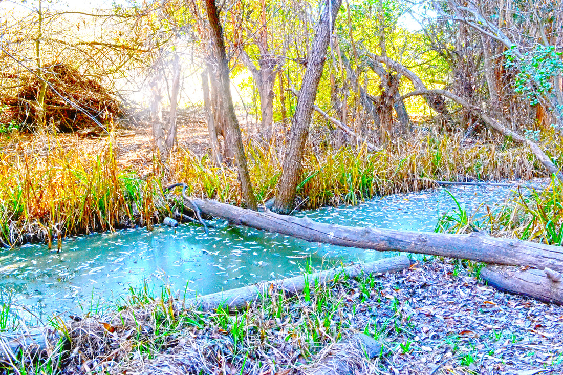
Yvette Moreno, Class of 2015, "Vibrant Swamp." Title of this picture would be Vibrant Swamp. The reason i chose that name is because it is a swamp and they are filled with mysteries and it is also colorful. I took this photograph at the duck pond. The main subject would be the grass that is coming out from the lake. I was aiming for exactly what i got only thing that surprised me was the tree. I like this artwork because the colors are vibrant and that makes it pop out. I used the HDR tools in Photoshop and all that was necessary to create this was to take 5 pictures of the same subject with different exposures
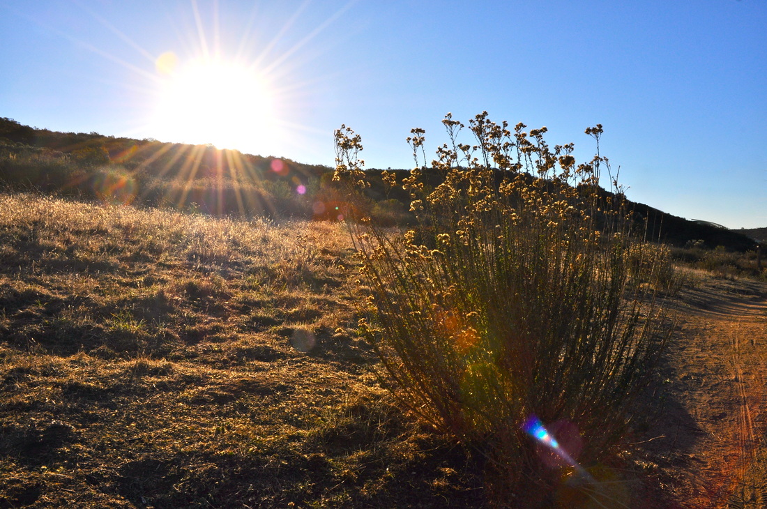
Amber Mularski, Class of 2014, "Beautiful Boca." I absolutely love taking pictures and this is one of my favorite photos. I decided to name it "Beautiful Boca because of the sunlight going across the screen. The boca the sunlight creates is really beautiful it pulls the whole picture together. I took this photo at the duck pond near my school. My idea for this image was to capture the sun shining across the gazebo without taking attention from the gazebo itself. I took the photograph at eye level straight on and angled it just the right way so that the sun is shining across the picture but not making the picture too bright. I was overall aiming for an image that displays a very beautiful and calming mood. This is my favorite because i really love nature shots and i especially love the way the sun can make a photograph look. I chose to put this in the gallery because i feel like its one of my best photos and i really enjoyed editing this photo. I used a little bit of HDR in this photo. HDR is high def resolution and you take five photos of the same image and then you merge them together through photoshop. I then messed with the detail to bring out the ground and the bushed. Then i adjusted the saturation to make the gazebo stand out and to make the sunlight bocas for colorful. I then adjusted the specific yellow coloring in the image to give the picture a warm feel to it.
Jose Murillo, Class of 2014, "The Yellow Bee." I call this the yellow bee because that is my main subject. I took this photo in the garden where the memorial plaque of Mrs.King. The main subject is the bee feeding off the flower. What i was aiming for was education for all because people gain knowledge by going to school and bees gain strength by feeding off of plants. I like this photo because it's not easy to capture a bee on a flower since they are always moving around.
David Muro, Class of 2015, "The Blue Stare." The title I gave for this photo is "The Blue Stare". It's titled this because it shows a worms eye view of liquid blue. I took this photo behind the drama room and stationed my camera on a tripod in between one of the many door frames. The main subject of this photo is the chair, but your eyes will drift up down side to side to try to figure out what the story is. What I was aiming for was a creepy almost horror-like story of an animal in a creepy area alone looking for another victim for its prey it's eyes turning a dark blue as it gets angry and then going on an adventure. The dirt on the wall looked great as a "blood" kinda look that this creepy shot was going for. I really enjoy this because the vantage point of being through a door frame and getting a very detailed panoramic of many subjects leaving you to really think of what I was trying to portray in the photo. This photo is my favorite also because the editing came out gorgeous. This shot was an HDR photo using 5 different lights and brightnesses to finally layer them and make it look very dramatic and nice. I used many different filters and changed the saturation to a dark sea blue and changed the light to its highest setting to really pop put the whites in the photo.
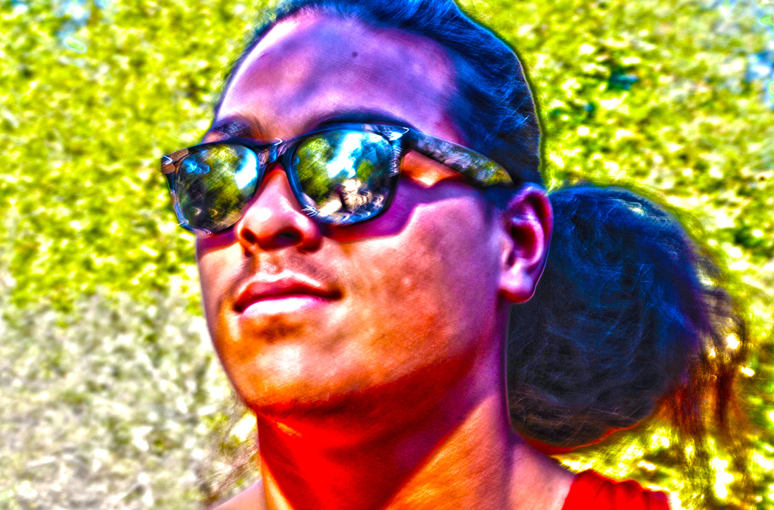
Jessica Nettles, Class of 2014, "The Face of Greatness." I choose the HDR photo with the vantage point of crop. I would name this the Face of Greatness because he has a slight smile with his head held eye looking towards the future. This photo was taken at the duck pond towards the pond. The main subject is Austin and i cropped it so the main focus would just be his face. I really like how HDR adds so much detail, but more importantly i like the way the colors on his face and in his sunglasses look. The way he smirked but didn't completely smile adds softness to all the colors around him. To make this picture so saturated i had to first make it into HDR and from there i super saturated it and increased the strength of the photo. Due to using HDR i was able to get all the details in his face and still have some details in the leaves.
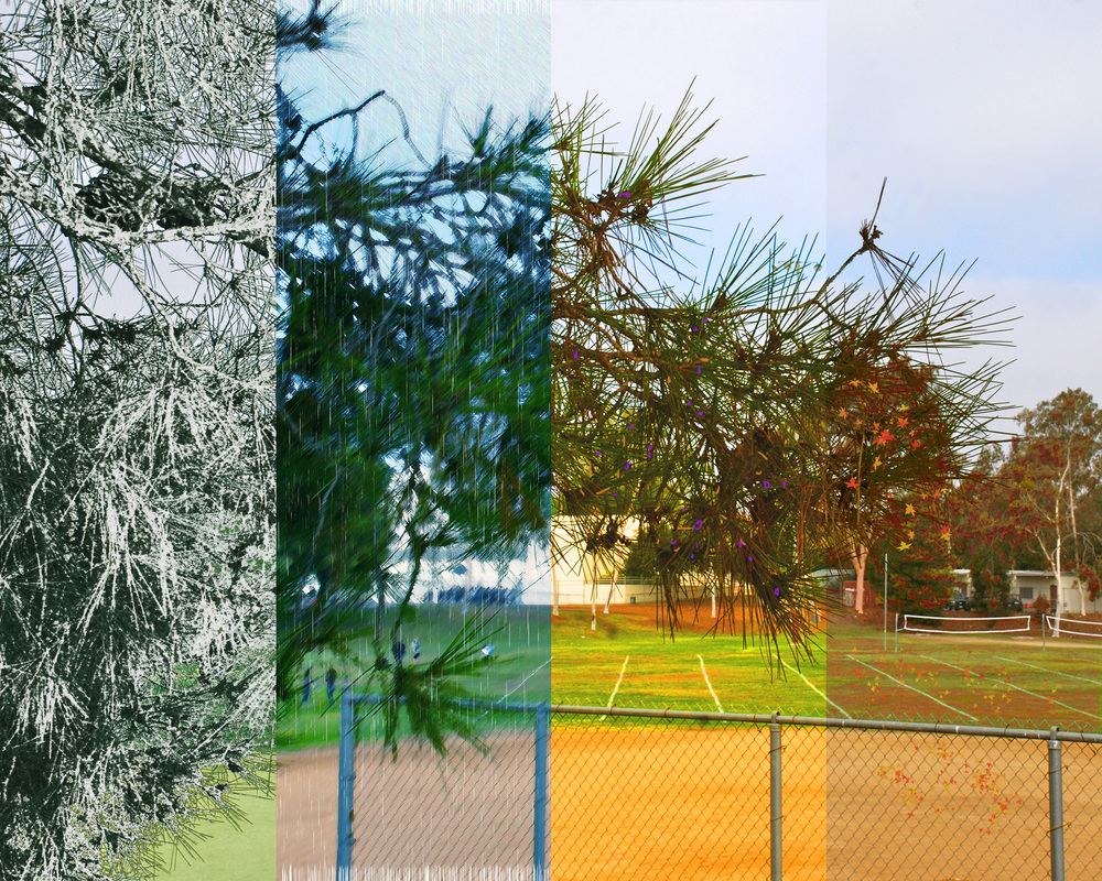
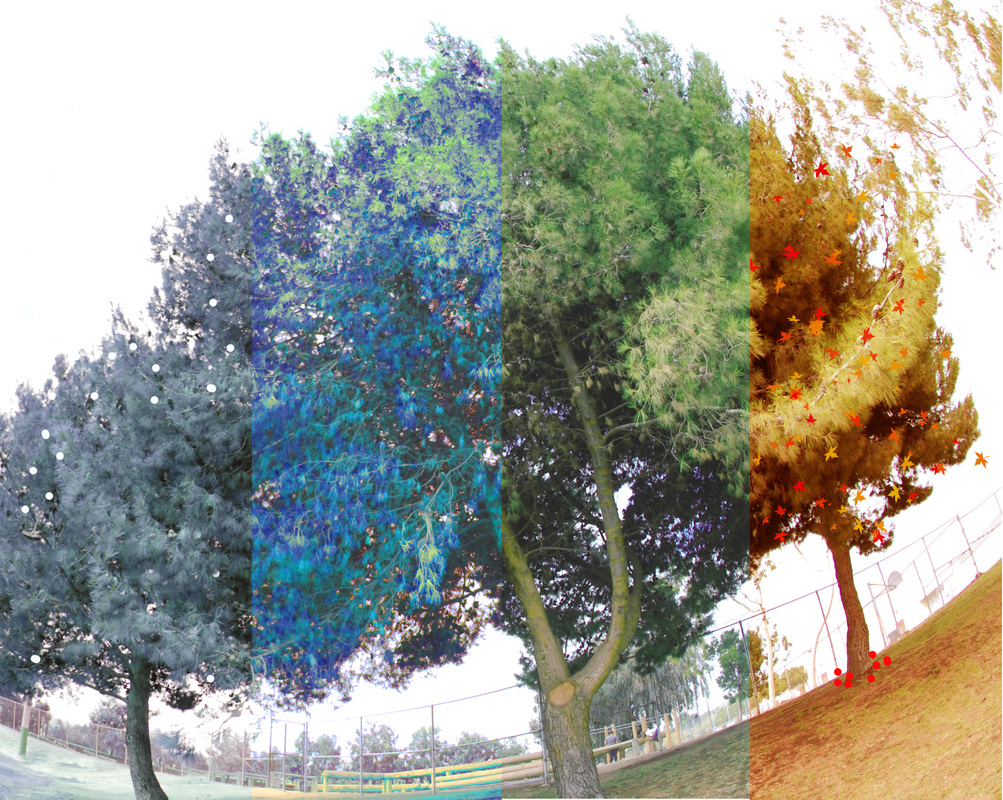
Nhat Nguyen, Class of 2014, "Miracle." This photo is called "Miracle" because it has many colors and affects that make it look absolutely gorgeous. This picture was taken in 4 different locations, mostly on the baseball field. The main subject of this photo is to make a landscape photo that has multiple affects in one. The photo includes 4 seasons and what specific about that season. I was aiming for creating the best photo that I possibly could. I do not like this one, I love it! That is because I put a lot of effort into this one to make it looks good. I used several techniques on making this photo. Using photo gallery to put noise affect in to one of the pieces. Desaturated on another one. Auto contrast for the third one. And Eyedropper tool for the last one. And there is the photo.
Dania Oregon. Class of 2014, "Untitled." I took this photograph at the duck pond in some pathway that I thought looked really nice from where i was standing. The main subject is the rocks because thats what the picture really focus on, and behind that is a pathways leading somewhere. I like this artwork because I thought it looked nice and the colors looked cool.
Jesse Ortega, Class of 2014, "Longhorn Field." I took this photograph at the field here at school at the turf field. I tried to go for the end of the field where it says "Longhorns". The subject is the long horn on the field. I like this picture because it shows alot of things in the photo but it's still simple. The steps I took to create this photograph was to merge all the 5 photos into HDR and just adjust the photos into what it is now.
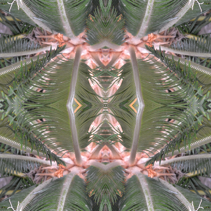
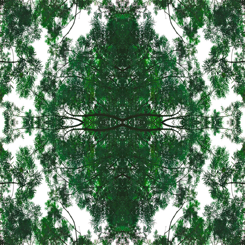
Anthony Pallonetti, Class of 2014, "The Trippy Palm Tree." The title of this photo is the trippy palm tree. I like this photo a lot because I love palm trees and I think this photo turned out very cool. I used the crop tool in Photoshop to crop the specific area I wanted to take and flipped the photos horizontally and vertically to give it the effect it has. I had fun doing the Mandala projects because I was always eager to see how they would turn out.
Shelly Quach, Class of 2014, "HDR". This is an HDR photo that I took at the Duck Pond. This artwork is titled as HDR because we took the steps to take High Definition Resolution photos to create a high quality looking photo. This photo draws your eyes to the main subject, the bush, then then bright sun in the background. Nothing is really going on in the photo, it's just simply a landscape photo. The bush is placed on the right hand side instead of the middle because I was aiming for a Rule of Thirds vantage point. I like this artwork because the sun is rising behind the hill creating sun rays in the photo. I chose this photo for the gallery because I love the harmony and peacefulness it brings out. After taking the photos, I opened up Photoshop to create HDR photos, I uploaded the pictures to photoshop by going File, Automate, then merge to HDR Pro. From there I apply Remove Ghost to get a better quality picture. I would add more Highlight or Saturation, whatever that is needed to make the photo look the best. I then click okay and it brings me back to Photoshop where I then select the Spot Healing Brush Tool to remove any blemishes that is on the photo.
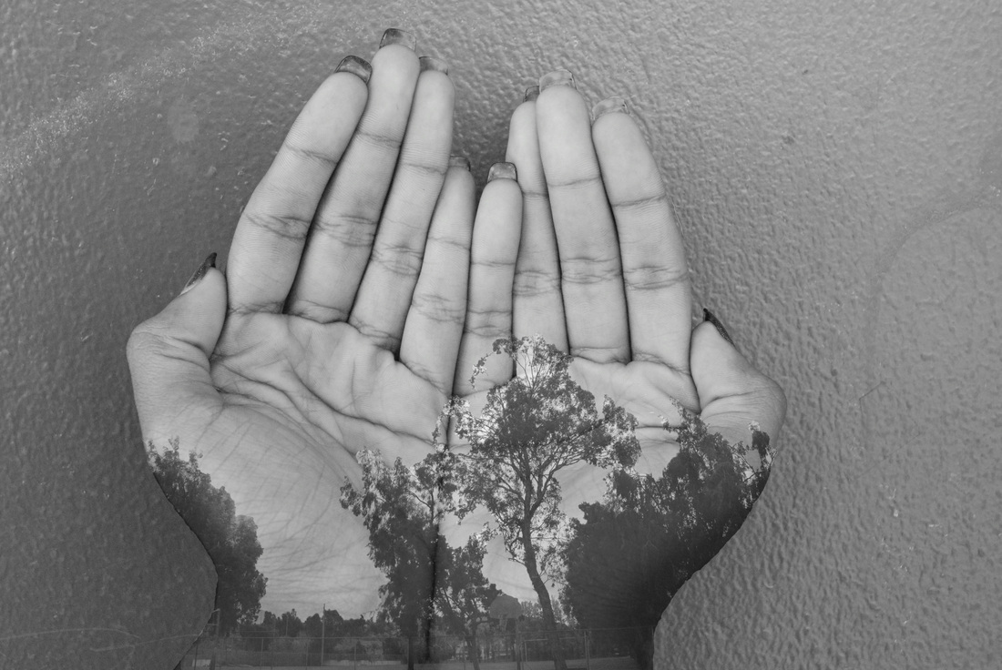
Luis Perez, Class of 2014, "Nature At Your Reach." The title of my photograph is “Nature At Your Reach”. I named it this because in the photograph you can see that the hands are holding trees. This photograph has an image of the P.E area. I took this photograph facing the subject straight from a far distance to capture most of the trees and landscape. The main subject was the trees and with the landscape. I was aiming to get the trees with as much detail as possible .I like this artwork because it gives a good look of trees with someone holding the photograph. To get the photograph to match with the hands I had to use Photoshop to erase the part’s of the photo to match with the hands. I used the layers and I organized to merge them into one photo.
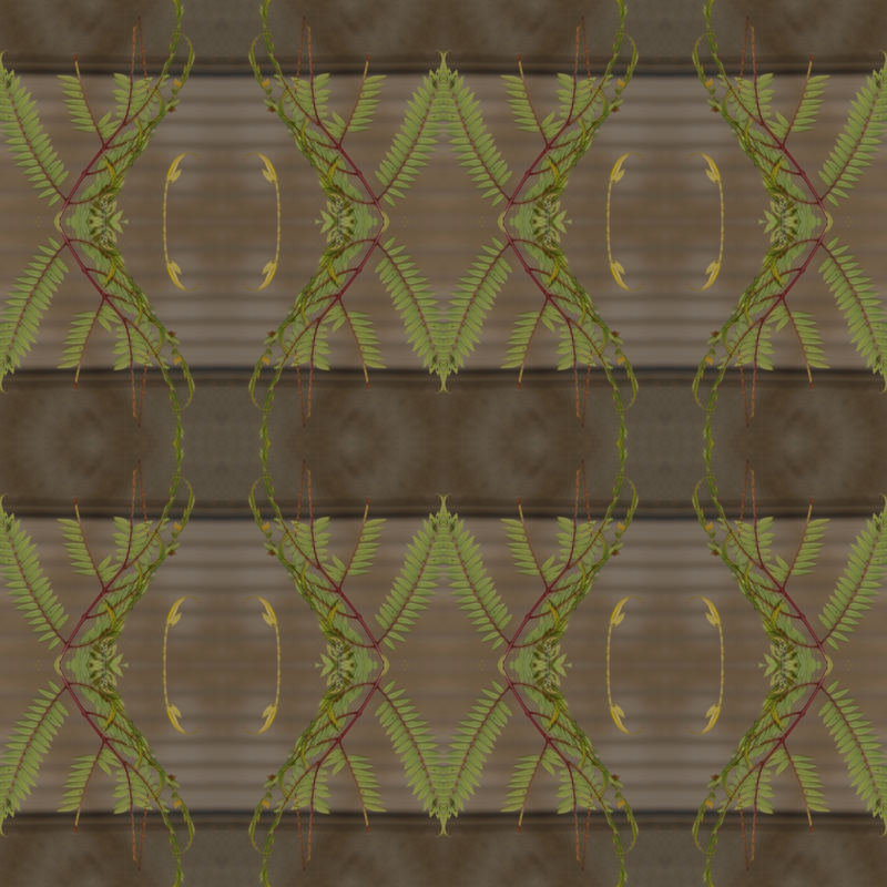
Alice Pierce. Class of 2015, "Branches". The title of my artwork is "Branches" because the main subjects of my photograph are some branches that I took of a tree around the campus. I liked it because it is the first time I'm doing this kind of work and I thought this was the best one because of the way the branches connect. The steps for doing this is create a template, crop the photo, duplicate the layers and flip them until I like the way it looks.
Viky Pineda, Class of 2014, "Sunny Day." I call this picture Sunny Day. It's titled this way because the way the sun goes through the two trees. The sun makes it stand out a lot and gives a special touch to the tress and its leaves. I took this photograph at the duck pond. I was aiming for both the trees pretty much exactly how it is in the picture. I like this picture just in general how it look and how the leaves of the trees look. What I used to create this picture this way was to add more saturation and brightness.
Josue Ramos, Class of 2014, "Bumble Bee Free." I titled this picture bumble bee free because it depicts a beautiful bee in its natural habit. I took this photograph in school.
Angel Reyes, Class of 2014, "Chase is cool" The reason why I titled this photo "Chase is cool" is because Chase is a really cool guy and I had no other title for this photo because it is really cool. I took this photo at the duck pond during 4th period for an assignment. The main subject in the photo would be Chase. In the photograph I asked Chase to pose and this is what he chose and it came out pretty good. I was aiming for a funnier picture but with the editing it came out a little more moody but cool at the same time. I like this artwork because it is really fun and interesting to do . I chose this picture to submit in the gallery because the highlights of Chase's clothing looks good with a black and white background and foreground. The steps I took in the Adobe Photoshop were making two separate layers of the same picture but making the top layer black and white, or desaturated, and from there I would erase certain parts from the top black and white layer so that a color would start to show from the original picture.
Elizabeth Reyes, Class of 2015, "Fall Tree." The title of my artwork is Fall Tree. The reason I named it like this, is because it's a tree and it has colors of fall because of the leafs. I took this photograph here on campus of a tree because I thought it looked pretty cool and it had pretty colors.The main subject in this photograph is the tree and I wasn't really aiming for anything specific, i just took the photo. I chose this photograph to submit to the gallery because I think it's really unique and it looks very pretty.The technique I used in Photoshop was the mandala format which is you just crop out a section of the original photo and make four squares and put each picture in and just switch each one either horizontal or vertical.
Ocean Rideaux, Class of 2014, "The Pathway" I chose my title because it's something that is kind of self explanatory, but still you can put your own imagination in. My photograph was taken at the Duck pond about a mile in. It took a few different shots for this picture to come out the way it did. The main subject of this picture was to show the path and it's never-ending length, as well as the bright highlight on top. I like this one because it's one of my recent pictures and I enjoyed the journey that led to this photograph. Many steps led to this picture that included Photoshop. First I took 5-6 different pictures of the same subject and changed the exposure for each one. Then when I uploaded the photographs to Photoshop I used HDR Pro to combined all of them. While in HDR Pro I fixed multiple things that included saturation, detail, vibrance, and etc. Finally when I was done I went back into Photoshop and cropped it to the size I wanted and touched it up a little. It was time consuming, but in the end it was worth it.
Christian Rivas, Class of 2014, "Insane Nature." My piece is called insane nature because when you look at it, it looks crazy and insane but it's a simple picture of a flower. I took this photograph by the front office where they had some nice flowers. The main subject is the flower. I was just aiming to take a picture with a lot of shapes with a little bit of colors. I like it because it stands out and it looks insane. I used more brightness and had to rotate them horizontally and vertically.
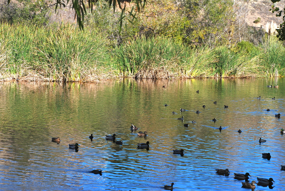
Michelle Rivera, Class of 2014, "The Duck Pond." I named this artwork the Duck pond, it's titled that way because i took this picture at the duck pond. The main subject of the picture are the ducks and the color yellow in the background how it stands out. I was aiming for a clear and detailed shot. I really liked this photograph because how clear the water looks and how the ducks came out. When editing this picture, I enhanced it in iPhoto.

Diego Rodriguez, Class of 2015, "The Path." I titled this photograph The Path. I named it The Path because the pathway in the photograph the pathway is the center of attention. I took this photo when I was at the Duck Pond near the trails. The main subject is the path which looks like it is going off into the unknown giving it a sense of mystery and also the fall leaves in the corner give it a sense of adventure. I like the artwork because the colors are vibrant and just pop off the screen. Also I like that it makes me feel adventurous and want to explore. In photoshop, I hade to create and HDR to get such a high quality photo. First, I had to click automate and merge to HDR pro. Then I had to select the different photos that I took of the same scene but with different exposures. Then I changed some settings to make it look good as possible and I was done.
Michelle Rodriguez, Class of 2014, "New beginning" This photo symbolizes a new beginning because it's the start of the two flowers life. I took this photo by the art room. The main subject is the yellow flowers. I was aiming for a grungy look. I really love this photo because it can have different meanings for each person who views it. In Photoshop I enhanced the detail with a fade filter.
Christian Rosenkranz, Class of 2014
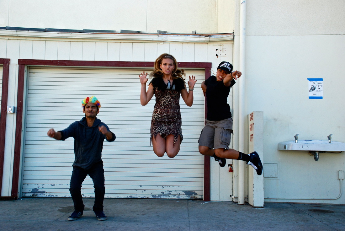
Carter Ross, Class of 2015, "Silly Jumpers." The title of the of this picture is Silly Jumpers. It has this title because of everyone in this picture is being silly and just having a good time. This photograph was taken right in front of the gym at school. The main subject are the crazy people in their Halloween costumes jumping in the air. I was aiming for a good jumping picture but Yasin was still on the ground which made this picture very interesting. I like this because it's fun and super crazy! I just had a fast shutter speed to take this picture and didn't edit it at all in iPhoto or photoshop.
Irwin Sanchez, Class of 2014, "Mystery." This Photograph is called "Mystery". It's named this way because of the way she is positioned. I took this picture in the 200 wing on the plant area. The model is Amber and I was aiming for mystery. I really like this picture because of how focused the lens is on her and on the leaf in front of her face. This assignment was one of my favorites because we had to reserch a famous photographer and I had my partner posing in different shots and positions to make it look like the famous photographer that I was researching's work, Josef Koudelka. I really like this picture because the picture camera focused really well on the whole subject. This picture creates mystery because of the way she is holding the leaf and other than that i think its one of my best pictures. In Photoshop I just adjusted the color and contrast.
Mackenzie Sanchez, Class of 2014, "The Crossing." Photo class has taught me a lot this year. From not being able to take a simple picture, to being committed to taking the PERFECT picture. Here, we learn how to work together and feed off each other to expand our ideas on an everyday basis. This photography class teaches a lot more than just how to use a camera. It combines art, history and technological awareness all in one. It teaches us how to strive for perfection, to get that amazing photo. I like to call this picture "The Crossing". I took this photo at the duck pond while we were shooting our HDR, High Dynamic Range, photographs. As soon as i saw the scene, i knew i could get a good picture, and tried to get as much of the nature as I could. In Adobe Photoshop, I used the Merge to HDR edit to add the same five images that had all different exposures. Once photoshop created the merged photo, I used the editing tools on the side tool bar to add contrast, saturation, vibrance, gamma, and sharpness. This has to be my favorite picture that I have taken this year, and I am pretty proud :)
Jacqueline Sarmiento, Class of 2014, "Buzzcutt Season." This photo is called "Buzzcutt Season." I wanted to name this photograph because its a lyric from one of my most favorite songs. I took this deep in the duck pound. The main subjects are the trees and the beautiful scenery, I was aiming for a forest dark and full of life. I love this artwork because its a beautiful way to express the little things in life like the trees and the sun,sky, and how amazing nature is. The technique I used was to have the contrast and brightness increase to give it a nice pop and thats all the editing I used for this rad photo!
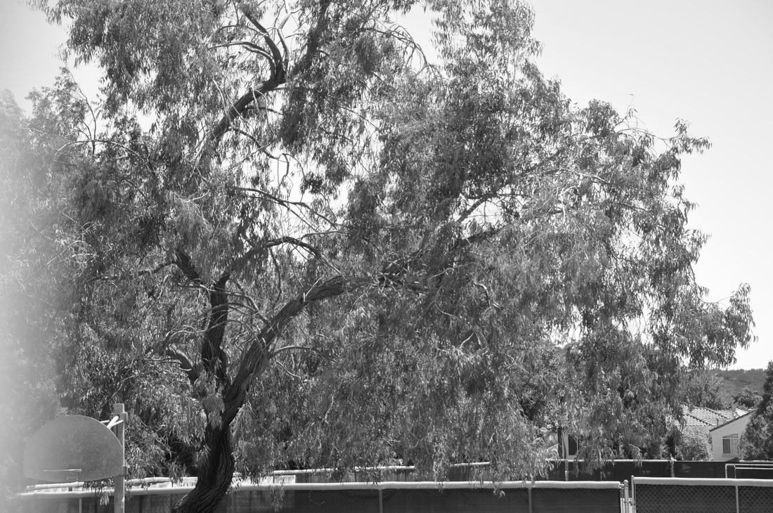
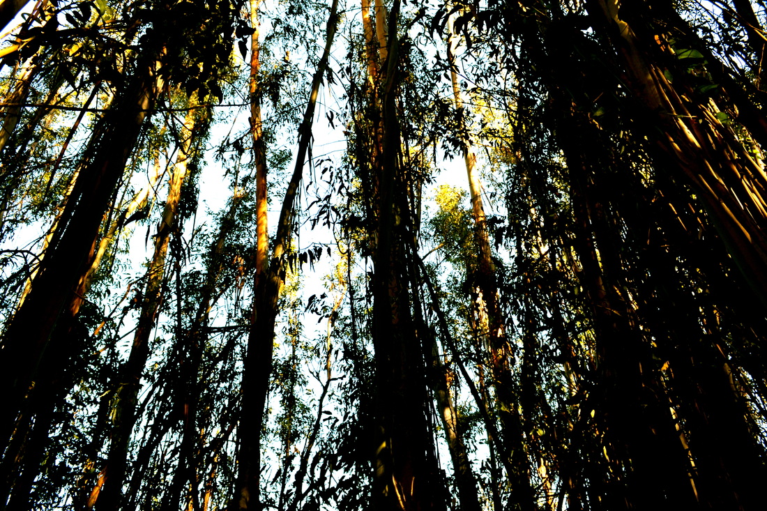
Setareh Savar, Class of 2014, "Fragile." The titled this photo fragile because it is an old tree that isn't as strong as it use to be. I took the photgraph at Rancho Bueno Vista High School by the basketball courts. When I took the photo I already knew I was going to make it black and white. The subject in this icture is the tree and how it is tilted to the side. I really like this picture because I love black and white pictures and I love the way the leaves on the tree are draped to the right. The steps I used in Photoshop were changing the saturation and then using contrast to make certain areas darker and certain areas lighter.
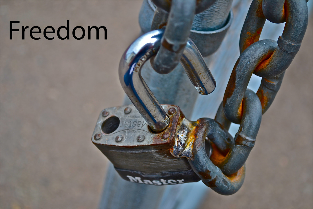
Briana Schaff, "Freedom." This is definitely my favorite photo that I have created this year. I call it my “Freedom” photograph one because it says it on the picture but also because I really think this open lock is an outstanding example of freedom. I took this picture on campus over at the stadium. It was on a open gate that was unlocked. I took this picture on September 11 and our class goal was to take pictures of patriotism. I feel that Freedom plays a big part in Patriotism and in America. Freedom represents who we are and want we want to be. That is why I took this picture and that is what I was aiming towards. I chose this photo for the gallery because it’s my favorite and also it is such a simple picture with a very strong meaning behind it. Before I used Photoshop I used iPhoto to enhance the photo. I also changed the definition, highlights, sharpness, and de-noise to 100%. I also changed shadows to 25%. After I made all of these changes I uploaded it to Photoshop and added the word "Freedom".
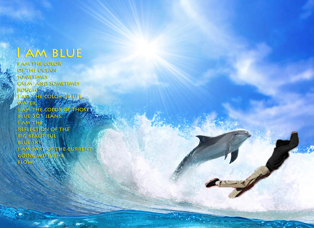
Emanuel Serrato, Class of 2014, "The Black Swordfish(TBS)" I was on the track jumping on the big bag thing at the end of the field. Jah feel? I think the Dolphin and I share an equal amount of being the main subject cause it's like wow a dolphin jumping out the water and if you look a little to the left what do you see? tell me! a black sword fish jumping out the water swimming along with his friend Dolphin.What I'm trying to say here is that we can all get along no matter how different we are.ahaha:)
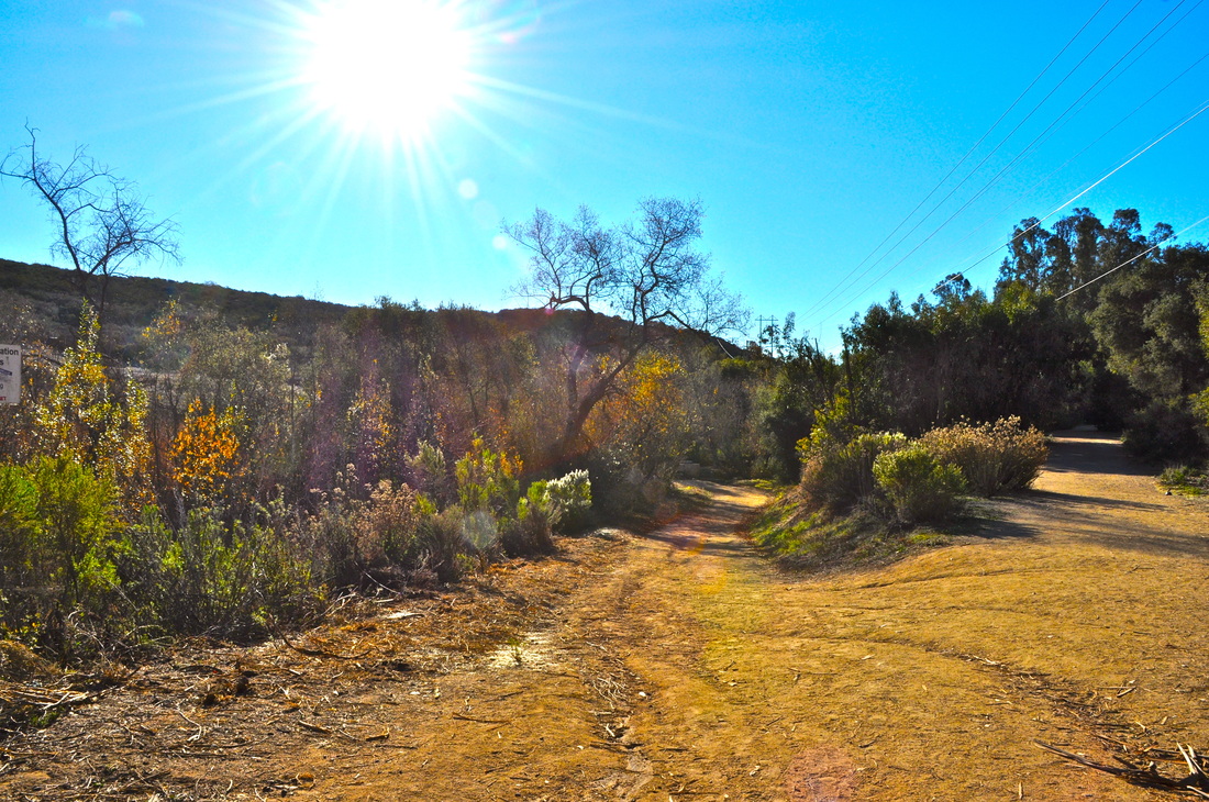
Nathaniel Smith, Class of 2014, "Duck Pond Landscape." The title of this photograph is Duck Pond Landscape Photo. Its titled that way because its a landscape photo. My favorite type of photos are landscape photos. I took the photograph at the duckpond on one of the side trails. The main subject of the photo is is the leading line which is a trail. I like this artwork because its my favorite type of photo a landscape photo.
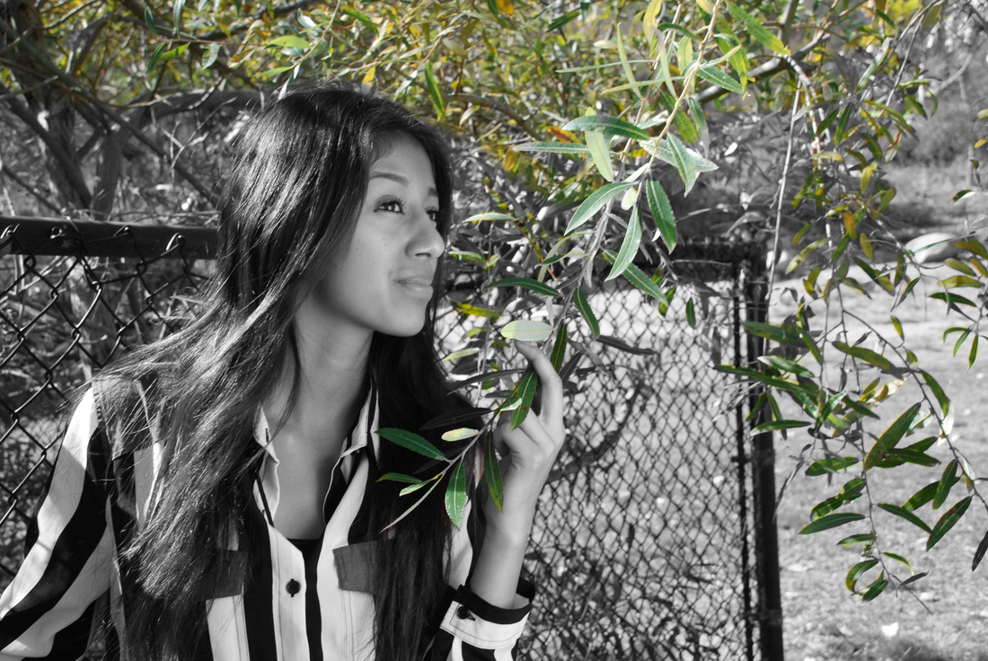
Maria Selena Sosa, Class of 2014, "Embrace the Essence of Nature." It is titled this because in the photograph Kendra is grasping a small branch as she looks though the horizon in which it seems as though she is embracing that exact moment. This photograph was taken at the duck pond. The main subject is Kendra. Kendra is looking away as she holds the small branch. I was aiming to get a good self portrait of Kendra, but also getting a semi detailed background. I like this artwork because the whole photo is edited to black and white, besides the leaves in the background and in her hand. I chose this photo because i like the pose Kendra is in and i like the selective color of the photo. after i put the photo in photoshop i heightened the brightness and changed the complete photo to black and white. I then erased the black and white edit from the leaves which turned them to green again. The high definition resolution was set at 300 which creates the detail.
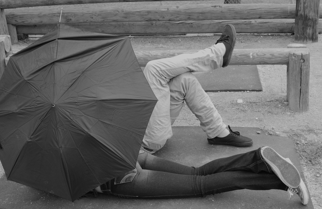
Perla Soto, Class of 2015, "Love Is In The Air". I named my photograph "Love Is in the Air" because I really felt like this picture expresses love. I took this photograph near the blacktop in the back of the school. The main subject is the couple in the picture. In the picture, the girl is holding the umbrella while laying down with her boyfriend, having a relaxing day. The steps I took in Photoshop were just that I filtered the image with black and white and tried to crop the picture to a good level where you can see the main object clearly.
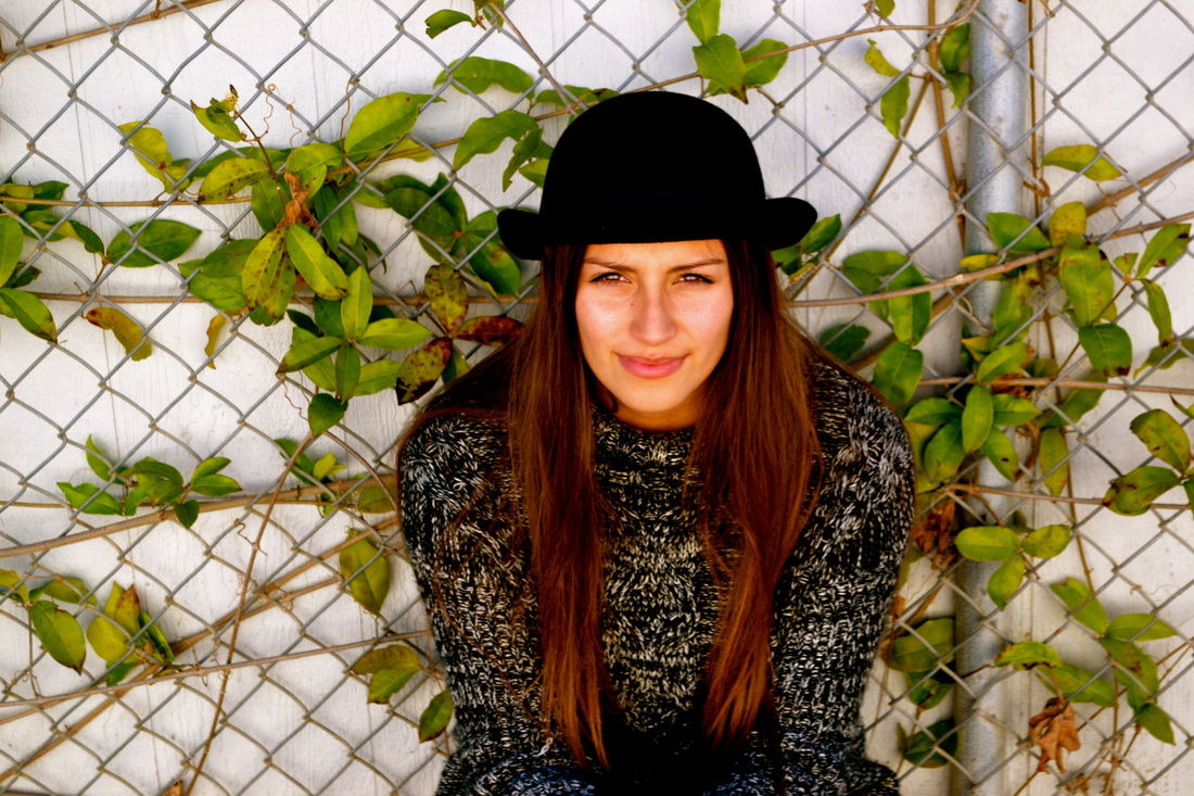
Matt Tauese, Class Of 2015, "Untitled." I Took This Photo By The Baseball Field. The Main Subject Of This Photo Is To Capture The Look Of Her Eyes, Its One Of My Favorites.
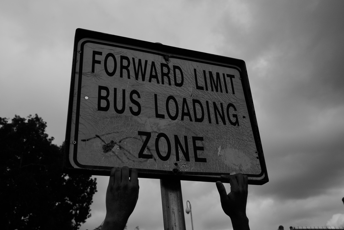
Monet Taylor, Class of 2015, "Breaking Barriers" I named this photograph that title because it symbolizes poor or homeless people trying to break barriers. I took this photo in the student parking lot. I was aiming to portray a photographer by the name of Eugene Smith. I like this photo because it says a lot with just the hands reaching on the sign. I changed the photo to black and white and increased the contrast to make it more bold.
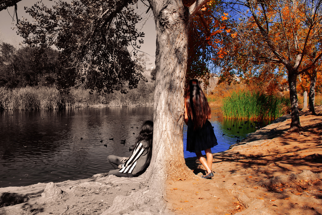
Ashton Thomas, Class of 2014, “Two Worlds”. “Two worlds” represent the two different lifestyles of people in our world, a world with color and a world without. Both Worlds are beautiful in their own way. In both sides of the photo the girls are appreciating the beauty of the duck pond although they are seeing two completely different styles. Everyone has their own perspective of the world, because no two people are the same. “Two Worlds” represents the differences we see everyday as individuals.
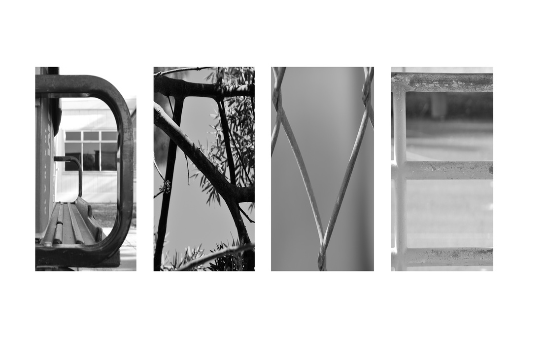
David Walmsley, Class of 2014, "DAVE." This fantastic piece of artwork is titled "DAVE". I chose this title because it is short, emphatic and perfectly describes the photo. The photo I chose was the name project. Therefor using landscape this photo spells my name, Dave. I took four different photos for this masterpiece. I took those four photos at Rancho Buena Vista High School. The "D" is a a photo of the back of a golf car. The "A" is a photo of tree branches. The "V" is a photo of a chain linked fence. The "E" is a photo of a series of railings near the basketball courts. I like this piece of artwork because it is very creative, and I had to work hard to create the masterpiece. In order to create this artwork, I first edited each individual photo to make it black and white. I then used a template to combine four different photos into one. From there I placed each photo in its proper position, which resulted in the spelling of my name.
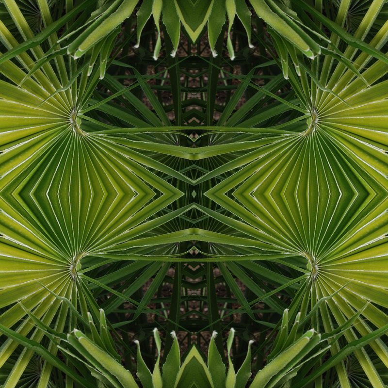
Jack Weickgenant, Class of 2014, "Mystery." I named this picture mystery because the way the picture looks you wonder how it got that way. I took the photo by the front of the school in the planter. The main subject is a small palm tree and in the photograph it is of the palm tree leaves all distorted into different shapes. What I was mainly aiming for is a cool design with the leaves. In Photoshop to make the picture the way it is I had to copy and paste a portion of the photo and then flip the picture horizontal and vertical in order to get the image I did.
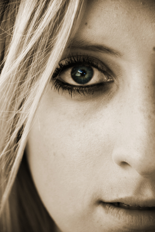
Brianna Winbigler, Class of 2014, "Taylor."
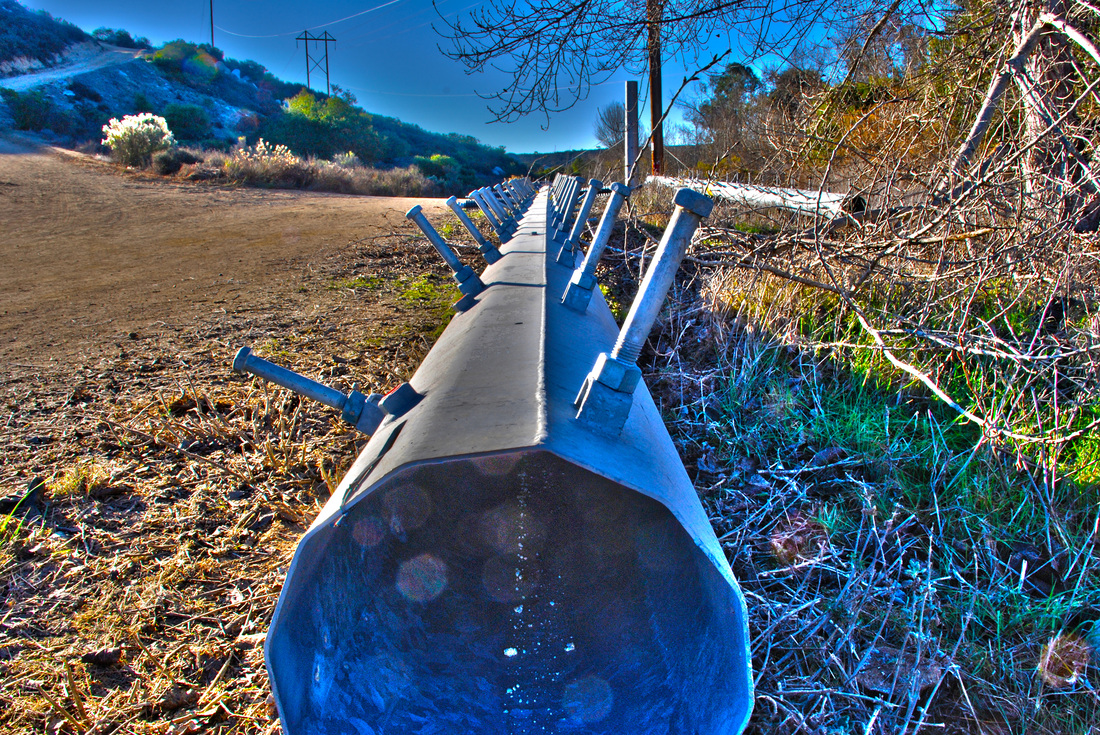
Erika Yanez, Class of 2014, "Majestic." I titled it this way because when Shayda and I were staring at the picture she said majestic and then I thought it was the perfect name. It fits because of the colors and shapes. I took this picture at the duckpond. I was aiming for a leading line picture and I think it came out perfect :) I really like it because the colors look pretty. I used the HDR setting on photoshop and added more saturation.
 RSS Feed
